Tag

Cross-Device Compatibility

Browsing

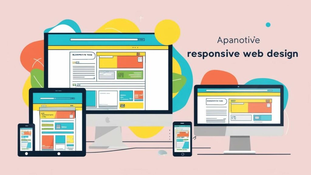
In today’s digital world, creating a seamless experience across devices is essential. Responsive web design ensures your site looks great on desktops, tablets, and phones. This approach uses flexible grids, fluid images, and CSS media queries to adapt to different screen sizes.

Ethan Marcotte introduced this concept, emphasizing the need for websites to adjust automatically. Whether a user is on a large monitor or a smaller screen, the layout changes to fit perfectly. This not only improves usability but also keeps visitors engaged.

This guide will walk you through essential techniques and practical examples. You’ll learn how to use media queries and optimize your site for various devices. By the end, you’ll have the tools to create a user-friendly experience for everyone.

Key Takeaways

  • Responsive design adapts to different devices and screen sizes.
  • Flexible grids and fluid images are key components.
  • CSS media queries help adjust layouts dynamically.
  • This approach improves user experience and engagement.
  • Practical examples and techniques will be covered in this guide.

Understanding Responsive Design and Its Importance

The rise of multiple devices has reshaped how we approach web layouts. With smartphones, tablets, and desktops in use, a one-size-fits-all solution no longer works. This is where responsive design comes into play. It ensures your site adjusts seamlessly to any screen size or device.

Defining Responsive Design

Responsive design is a method that automatically adjusts a website’s layout based on the user’s device, screen size, and orientation. It uses flexible grids, fluid images, and CSS media queries to create a dynamic experience. This approach eliminates the need for separate designs for each device.

Evolution and Need for Flexible Web Solutions

In the early days of the web, layouts were static and designed for desktop screens. As mobile devices became popular, fixed designs struggled to adapt. Ethan Marcotte introduced the concept of responsive design in 2010, emphasizing the need for a unified approach. His work revolutionized how we think about web layouts.

Today, the variety of devices demands a flexible solution. A single codebase that works across desktops, tablets, and smartphones saves time and resources. It also ensures a consistent experience for users, no matter how they access your site.

Key Principles of Responsive Web Design

Modern web users expect seamless experiences across all devices. To achieve this, responsive web design relies on core principles like fluid grids, flexible layouts, and adaptive images. These techniques ensure your site looks great on any screen size or device.

Fluid Grids and Flexible Layouts

Fluid grids are the backbone of responsive design. Instead of fixed pixel widths, they use relative units like percentages. This allows elements to resize dynamically based on the viewport size. For example, a three-column layout might adjust to two or one column on smaller screens.

Here’s a simple example of a fluid grid in CSS:

.container {

width: 100%;

max-width: 1200px;

margin: 0 auto;

}

.column {

width: 33.33%;

float: left;

}

This ensures your layout adapts smoothly to different devices.

Adaptive Images and Intelligent CSS Use

Images are a critical part of any website. To make them responsive, use the max-width property in CSS. This ensures images scale down to fit smaller screens without losing quality. Here’s how:

img {

max-width: 100%;

height: auto;

}

Intelligent CSS strategies also include using media queries to apply specific styles based on screen size. For instance, you can hide non-essential elements on mobile devices to save space.

Principle Description Example
Fluid Grids Uses relative units for dynamic resizing. width: 33.33%;
Flexible Layouts Adjusts columns based on screen size. Three columns on desktop, one on mobile.
Adaptive Images Scales images to fit different devices. img { max-width: 100%; }
Intelligent CSS Uses media queries for device-specific styles. @media (max-width: 768px) { … }

These principles are essential for creating a user-friendly experience. By mastering fluid grids, flexible layouts, and adaptive images, you can build websites that work seamlessly across all devices.

Responsive Design: Boost User Experience on All Devices

User behavior and environmental factors play a crucial role in shaping modern web experiences. To create intuitive and engaging sites, designers must consider how users interact with their content across different devices and settings.

Understanding User Behavior

How users engage with a website varies greatly depending on their device. For example, touchscreens require larger buttons and simplified navigation. Gestures like swiping and tapping are common on mobile devices but not on desktops.

Orientation changes also impact the layout. A landscape view might display more content, while a portrait view prioritizes simplicity. Designers must account for these behaviors to ensure smooth interactions.

Environmental Factors in Design

External conditions like lighting and location can affect how users interact with a site. Bright sunlight might make small text hard to read, while low-light environments may require higher contrast.

For instance, a travel app might adjust its color scheme based on the user’s location. This ensures readability and usability in various settings.

Real-World Examples

Many websites adapt their layouts for different devices. A desktop version might feature a multi-column design, while the mobile version stacks content vertically. This approach ensures a consistent experience across platforms.

By understanding the target user and their environment, designers can create more intuitive and accessible experiences for everyone.

  • Touch interactions require larger, easy-to-tap elements.
  • Orientation changes influence layout adjustments.
  • Lighting and location affect readability and usability.
  • Real-world examples show how sites adapt to different devices.
  • Considering these factors enhances overall user satisfaction.

By focusing on user behavior and environmental factors, designers can craft websites that meet the needs of diverse audiences. This approach ensures a seamless experience, no matter how or where users access the site.

Setting the Viewport for Optimal Accessibility

The viewport meta tag is a cornerstone of modern web accessibility. It ensures your site renders correctly on any device, from desktops to smartphones. Without it, pages may appear zoomed out or improperly scaled, leading to a poor user experience.

To set the viewport, include this tag in your HTML’s

section:

<meta name=”viewport” content=”width=device-width, initial-scale=1.0″>

This code tells the browser to match the page’s width to the device’s screen width. It also sets the initial zoom level to 1.0, ensuring content appears at its intended size.

Proper viewport settings improve accessibility by making text and elements easier to read and interact with. For example, buttons and links become more touch-friendly on smaller screens. This is especially important for users with disabilities who rely on mobile devices.

However, omitting the viewport tag can cause issues. Pages may shrink to fit desktop dimensions on mobile devices, forcing users to zoom in manually. This disrupts navigation and can frustrate visitors, leading to higher bounce rates.

Here’s how the viewport tag enhances user experience:

  • Ensures content fits the screen width.
  • Improves readability and touch interactions.
  • Prevents unnecessary horizontal scrolling.
  • Supports accessibility for all users.

By setting the viewport correctly, you create a seamless experience across devices. This small but powerful tag is a must-have for any modern website.

Implementing CSS3 Media Queries for Dynamic Layouts

CSS3 media queries are essential tools for creating dynamic layouts that adapt to various devices. They allow developers to apply specific styles based on the user’s screen size, orientation, and other device features. This ensures that your site looks great on desktops, tablets, and smartphones.

Understanding Min-width and Max-width

Media queries often use min-width and max-width to define breakpoints. These breakpoints determine when certain styles should be applied. For example, you might want a three-column layout on larger screens but switch to a single column on smaller devices.

Here’s a simple example:

@media (min-width: 768px) {

.column {

width: 33.33%;

}

}

@media (max-width: 767px) {

.column {

width: 100%;

}

}

This code ensures that columns adjust based on the screen size.

Device-specific Queries and Orientation

Media queries can also target specific device features, such as orientation. For instance, you might want to adjust the layout when a user switches from portrait to landscape mode.

Here’s an example:

@media (orientation: landscape) {

.header {

height: 200px;

}

}

@media (orientation: portrait) {

.header {

height: 100px;

}

}

This ensures that your site remains user-friendly in any orientation.

Feature Description Example
Min-width Applies styles for screens wider than the specified value. @media (min-width: 768px) { … }
Max-width Applies styles for screens narrower than the specified value. @media (max-width: 767px) { … }
Orientation Adjusts styles based on device orientation. @media (orientation: landscape) { … }

By mastering CSS3 media queries, you can create layouts that adapt seamlessly to any device. This improves user experience and ensures your site remains accessible and functional across all platforms.

Optimizing Images in Responsive Web Design

Images play a vital role in enhancing the visual appeal of any website. However, poorly optimized images can slow down load times and frustrate users. In web design, ensuring images adapt to different screen sizes is crucial for maintaining both speed and clarity.

Using max-width for Fluid Images

One of the simplest ways to make images responsive is by using the CSS max-width property. This ensures that images scale down to fit their container without exceeding its dimensions. Here’s an example:

img {

max-width: 100%;

height: auto;

}

This code prevents images from stretching beyond their container, ensuring they look sharp on any device. It’s a quick and effective solution for fluid layouts.

Alternative Approaches: The HTML <picture> Element

For more control, the HTML <picture> element allows you to serve different images based on screen size. This is especially useful for high-resolution displays or mobile devices. Here’s how it works:

<picture>

<source media=”(min-width: 768px)” srcset=”large.jpg”>

<source media=”(max-width: 767px)” srcset=”small.jpg”>

<img src=”default.jpg” alt=”Example image”>

</picture>

This approach ensures users download only the most appropriate image for their device, improving performance and load times.

Best Practices for Image Optimization

  • Use modern image formats like WebP for better compression and quality.
  • Compress images to reduce file size without sacrificing clarity.
  • Set appropriate dimensions to avoid unnecessary scaling.
  • Lazy load images to improve initial page load speed.

By following these steps, you can ensure your images look great and load quickly on all devices. This enhances user experience and keeps visitors engaged with your site.

Leveraging Frameworks to Enhance Responsive Design

Frameworks like W3.CSS and Bootstrap simplify the process of creating adaptable websites. These tools provide pre-built components and grids that automatically adjust to different screen sizes. By using them, developers can focus on functionality rather than reinventing the wheel.

W3.CSS, Bootstrap, and Other Tools

W3.CSS and Bootstrap are two of the most popular frameworks for web development. They offer ready-to-use elements like buttons, forms, and navigation bars. These components are designed to work seamlessly across desktops, tablets, and smartphones.

For example, Bootstrap’s grid system divides the layout into 12 columns. This allows developers to create flexible designs that adapt to various devices. Similarly, W3.CSS provides lightweight styles that ensure fast loading times.

Benefits of Using Frameworks

Using frameworks can significantly reduce development time. They eliminate the need to write repetitive code for common elements. This speeds up the prototyping process and ensures consistency across pages.

Frameworks also enforce best practices in web design. They include built-in support for accessibility and cross-browser compatibility. This makes it easier to create websites that work well for all users.

Framework Key Features Use Case
Bootstrap 12-column grid, pre-built components Rapid prototyping
W3.CSS Lightweight, responsive styles Fast-loading websites
Foundation Customizable, modular design Complex layouts

Real-world examples include e-commerce sites and blogs that use Bootstrap for consistent navigation. These frameworks ensure that users have a smooth experience, no matter the device they use.

By leveraging frameworks, developers can create adaptable websites more efficiently. This approach not only saves time but also enhances the overall user experience.

Prioritizing Content and User Usability Across Devices

Prioritizing content across devices is key to a seamless user experience. On smaller screens, essential information must be immediately visible. This ensures users can quickly find what they need without frustration.

Effective strategies include rearranging or hiding less critical elements based on the device type. For example, a tablet might display a sidebar, while a phone hides it to save space. This approach keeps the layout clean and focused.

Content Prioritization Strategies

Start by identifying the most important information for your users. Place this content at the top of the page or in prominent areas. Use visual hierarchy to guide the eye, such as larger fonts or contrasting colors.

For mobile devices, consider collapsing secondary content into expandable sections. This keeps the page tidy while still providing access to additional details. Less is more when it comes to smaller screens.

Designing for Touch and Interaction

Touchscreens require larger buttons and clear navigation cues. Ensure interactive elements are easy to tap, with enough spacing to avoid accidental clicks. This is especially important for phones and tablets.

Gestures like swiping and scrolling should feel natural. Test your layout on multiple devices to ensure smooth interactions. A well-designed interface enhances user satisfaction and engagement.

Conduct cross-platform usability testing to refine your content presentation. Gather feedback from real users to identify pain points and areas for improvement. This ensures your site works well for everyone, regardless of their device.

Real-world examples show how content-first approaches lead to better user experiences. For instance, e-commerce sites often prioritize product images and descriptions on mobile. This keeps users engaged and encourages purchases.

Balancing aesthetics and functionality is crucial. A visually appealing site must also be easy to use. By following these best practices, you can create a seamless experience across all devices.

Conclusion

Creating a seamless experience across devices is no longer optional—it’s a necessity. By leveraging fluid grids, media queries, and viewport settings, you can ensure your site adapts flawlessly to any screen size. These technical elements work together to deliver a consistent and engaging user experience.

Frameworks like Bootstrap and W3.CSS simplify the process, offering pre-built components that save time and effort. Prioritizing content ensures essential information is always accessible, regardless of the device used. This approach not only enhances usability but also improves performance.

As technology evolves, continuous testing and adaptation are crucial. A single, adaptable codebase simplifies maintenance and future-proofs your site. Start implementing these practices today to create more intuitive and user-friendly web experiences.

In today’s digital world, having a website that works well on all devices is key. Responsive design makes your site adjust to different screens, keeping your content and look great on any device. This means your site looks good whether someone is using a phone, tablet, or computer.

Responsive design is more than a trend; it’s a new way to build websites. It helps your site work well on any device, making it better for users and search engines. Plus, it saves you money in the long run.

Key Takeaways

  • Responsive design makes your website work well on all devices, giving users a great experience.
  • It’s essential for staying ahead in today’s mobile-focused world.
  • Responsive design boosts your site’s accessibility, SEO, and saves you money.
  • Creating a responsive site requires understanding fluid grids, flexible images, and media queries.
  • Good responsive design focuses on mobile users, easy navigation, and scalable text.

What is Responsive Design?

Responsive design is a way to make websites work on all devices. It makes sure your site looks good and works well on screens of all sizes. This gives users the best experience, no matter what device they use.

Definition and Importance

Responsive design means your website changes to fit any screen size. It’s important because people use many devices to visit websites. With responsive design, your site looks great on any device, improving the user experience.

How It Works

Responsive design uses flexible layouts and images to adjust to different screens. It uses media queries to detect and change based on the device. This way, your site always looks its best, no matter the device.

Key Features

  • Fluid layouts that adapt to different screen sizes
  • Flexible images and media that scale proportionally
  • Media queries that detect and respond to device characteristics
  • Consistent user experience across desktop, tablet, and mobile devices
  • Adaptive content that prioritizes and rearranges information based on screen space
Feature Description
Fluid Layouts Websites with fluid layouts use flexible grid systems and proportional units (such as percentages or viewport-relative units) to create adaptable and responsive designs.
Flexible Media Images, videos, and other media are designed to scale proportionally to their container, ensuring they fit seamlessly within the responsive layout.
Media Queries CSS media queries allow developers to apply different styles based on the characteristics of the user’s device, such as screen size, orientation, and resolution.

Benefits of Responsive Design

Responsive design is key in today’s digital world. It offers many benefits that improve user experience and help businesses succeed. Let’s look at the main advantages of responsive design.

Improved User Experience

Responsive design makes your website work well on all devices. It provides a consistent and optimized user interface, no matter the screen size. This leads to better engagement, higher conversion rates, and happier customers.

SEO Advantages

Search engine optimization (SEO) is key for a strong online presence. Responsive design helps improve your website’s ranking on search engines. Google and others favor mobile-friendly sites, knowing they’re more important for users.

By using responsive design, your site becomes easy to find and use on any device. This boosts your online presence and brings more visitors to your site.

Cost-Effectiveness

Before, having a desktop and mobile site was common but costly. Responsive design is a cheaper way to go. It lets you have one site that works on all screens, saving money on development and upkeep.

This approach also ensures a great experience for users on any device. It’s a smart move for businesses looking to save money without sacrificing quality.

Benefit Description
Improved User Experience Responsive design ensures a consistent and optimized user interface across all devices, enhancing engagement and satisfaction.
SEO Advantages Responsive websites are prioritized by search engines, improving online visibility and driving more traffic to your site.
Cost-Effectiveness Responsive design eliminates the need for separate desktop and mobile versions, reducing development and maintenance costs.

The Principles of Responsive Web Design

Responsive Design: Adapt Your Website For All Devices

Responsive Web Design: The Three Key Principles

Making a website work well on all devices is key to responsive web design. It’s all about flexible gridsflexible images, and media queries. These elements work together to give users a great experience, no matter the screen size.

Fluid Grids

Responsive design starts with a flexible grid system. Unlike fixed-width layouts, fluid grids use relative units like percentages. This lets content adjust to the device’s screen size, making everything look neat and organized.

Flexible Images

Images are vital on websites, and they must be flexible in responsive design. Using CSS, images can grow or shrink to fit the space, keeping their look and feel intact.

Media Queries

The last piece is media queries. These CSS tools let designers change styles based on device characteristics. This way, websites can offer tailored experiences, making everything smooth and efficient.

Mastering flexible gridsflexible images, and media queries lets designers make websites that adapt easily. This is essential in today’s world of diverse devices and screens.

Common Mistakes in Responsive Design

As more people use mobile devices, making websites work well on all devices is crucial. Yet, many businesses ignore common mistakes in responsive design. These mistakes can harm their online presence and how well they connect with customers.

Ignoring Mobile Users

One big mistake is ignoring mobile users. With over half of web traffic coming from mobiles, it’s vital to focus on mobile experiences. Not optimizing for smaller screens and touch interactions can make users unhappy, leading to lost customers.

Overlooking Touchscreen Compatibility

Smartphones and tablets have changed how we use the web. Responsive design must consider touchscreen needs. Ignoring these can make websites hard to use, causing users to leave quickly.

Neglecting Page Load Speed

Today, users expect websites to load fast, no matter the device. Slow sites can hurt user experience and SEO. Responsive design must focus on quick loading times, using techniques like image optimization and caching.

By avoiding these mistakes, businesses can create websites that work well on all devices. This can improve user experience, engagement, and business success.

Tools for Creating Responsive Designs

Responsive design is key in web development today. It ensures websites work well on all devices. Luckily, many tools and frameworks help designers and developers make responsive websites.

CSS Frameworks

CSS frameworks like Bootstrap and Foundation make creating responsive layouts easier. They offer pre-built components and grids. This lets designers focus on the user experience without worrying about technical details.

Design Software

Tools like Figma and Adobe XD have changed responsive design. They let designers create prototypes, test different sizes, and ensure a consistent user experience. These tools integrate design and development, making the process smoother.

Testing Tools

  • Browser DevTools: Modern browsers like Chrome and Firefox have tools that show how websites work on different devices.
  • Responsive Design Testing Apps: Tools like Responsive Design Checker and Responsinator let designers see their sites on many devices. This makes sure designs work well on all screens.
  • Device Labs: Real-world device labs help designers test their sites on many devices. This gives a full view of how users will experience the site.

Using these tools, web designers and developers can make websites that work great on any device. This means everyone gets a top-notch experience, no matter what they’re using.

Best Practices for Responsive Design

Making a great responsive website means knowing how people use devices. Web designers should follow best practices to make sure everyone has a good experience, no matter their screen size. Here are three important things to keep in mind.

Prioritize Mobile User Experience

Today, making your website work well on mobile is key. Start by making it work on the smallest screens first. Then, add more features as the screen gets bigger. This way, your site’s main parts are always easy to use, even on devices with less power.

Optimize Navigation

Good navigation is essential for responsive design. Make your menus easy to use and get to what you need quickly. Use things like hamburger menus and sticky headers to help users find their way, no matter their device.

Use Scalable Typography

It’s important for text to be easy to read on all devices. Use techniques like relative font sizes to make your text look good on any screen. This keeps your content clear and nice to look at, even on the smallest screens.

Best Practice Explanation Benefits
Prioritize Mobile User Experience Optimize your website for the smallest screens first, then enhance for larger devices. Ensures core content and functionality remain accessible on resource-constrained devices.
Optimize Navigation Streamline menu structure, minimize taps, and leverage mobile-friendly elements. Empowers users to easily navigate your website across all devices.
Use Scalable Typography Implement responsive font sizing techniques for improved readability. Ensures your content remains legible and visually appealing on any screen size.

By focusing on mobile, making navigation easy, and using scalable text, web designers can make websites that work well on all devices. This follows the ideas of progressive enhancement and adaptive content.

Responsive Design vs. Adaptive Design

In the world of website design, two distinct approaches have emerged: responsive design and adaptive design. While both aim to create user-friendly, device-agnostic experiences, understanding the key differences between these strategies can help businesses make informed decisions when crafting their multi-screen design.

Key Differences

The primary distinction lies in how each approach adapts to different screen sizes and devices. Responsive design uses flexible layouts, images, and CSS to automatically adjust the content to fit the user’s screen, creating a seamless experience across various devices. In contrast, adaptive design employs a more rigid, device-specific approach, where the website or application is designed for specific screen sizes and then served accordingly.

Use Cases for Each

  • Responsive design is well-suited for websites that need to cater to a wide range of devices, from desktop computers to smartphones and tablets, as it provides a consistent, device-agnostic user experience.
  • Adaptive design is often preferred for applications or websites with complex layouts and functionalities, where precise control over the user interface is crucial, such as in enterprise software or gaming platforms.

When to Choose One Over the Other

The choice between responsive and adaptive design depends on the specific needs of the project and the target audience. Factors to consider include the complexity of the website or application, the range of devices to be supported, and the desired level of control over the user interface. In general, responsive design is the more versatile and cost-effective option for most websites, while adaptive design may be better suited for specialized applications with complex requirements.

Case Studies of Successful Responsive Designs

In the ever-evolving digital landscape, cross-device compatibility and a mobile-friendly experience have become essential for businesses of all sizes. Let’s dive into real-world examples of companies that have seamlessly integrated responsive design into their online presence, setting the bar for exceptional user experiences.

E-Commerce Sites

Leading e-commerce platforms like Amazon and Wayfair have mastered the art of responsive design. Their websites and mobile apps adapt effortlessly, ensuring a consistent and intuitive shopping experience across devices. By optimizing their content, navigation, and checkout processes, these e-commerce giants have seen a significant increase in customer engagement and conversions.

Blogs and Content Sites

Renowned media outlets like The New York Times and CNN have embraced responsive design to deliver their content with elegance and efficiency. Their websites and mobile apps dynamically rearrange their layouts, typography, and imagery to provide readers with a seamless and enjoyable reading experience, regardless of the device they’re using.

Corporate Websites

Even large corporations, like Apple and Microsoft, have recognized the importance of responsive design. Their corporate websites adapt flawlessly, showcasing their products and services in a visually captivating manner. By ensuring a consistent brand experience across devices, these companies have strengthened their online presence and fostered deeper connections with their customers.

These case studies demonstrate the power of responsive design in creating exceptional user experiences, driving engagement, and ultimately contributing to business success. As the digital landscape continues to evolve, the ability to adapt to diverse devices and screen sizes will remain a crucial factor in the success of any online venture.

The Role of Media Queries in Responsive Design

As the digital landscape continues to evolve, one of the cornerstones of effective website design is the ability to adapt to various devices and screen sizes. This is where media queries, a key component of responsive design, play a crucial role. By understanding the power of media queries and their strategic implementation, web designers can create fluid, flexible grids that cater to the diverse needs of their audience.

Understanding Media Queries

Media queries are CSS-based rules that allow developers to target specific device characteristics, such as screen size, resolution, or orientation. These rules enable the website to adjust its layout, typography, and visual elements to ensure an optimal user experience across a range of devices, from desktops to mobile phones.

Using Breakpoints Effectively

The success of a responsive design lies in the strategic placement of breakpoints, which are the specific points at which the website’s layout and design elements adapt to different screen sizes. By carefully considering user behavior, device usage, and design principles, web designers can establish breakpoints that seamlessly transition the website’s appearance and functionality.

  1. Identify key breakpoints based on the most common device sizes and screen resolutions in your target market.
  2. Prioritize the mobile experience by establishing a strong mobile-first design foundation.
  3. Ensure that the website’s content and layout adapt gracefully across different breakpoints, maintaining a consistent and intuitive user experience.
Breakpoint Device Type Screen Size (in px)
Extra Small Smartphones 0 – 576
Small Tablets 576 – 768
Medium Laptops 768 – 992
Large Desktops 992 – 1200
Extra Large Large Desktops 1200+

By mastering the art of media queries and breakpoint management, web designers can create responsive websites that deliver an exceptional user experience, regardless of the device or screen size. This, in turn, can lead to improved engagement, higher conversion rates, and enhanced search engine optimization (SEO) performance.

As the digital landscape continues to evolve, responsive design is poised to undergo transformative changes that will shape the future of online experiences. Three key trends are emerging in the world of responsive design: mobile-first design, voice search optimization, and the integration of artificial intelligence (AI).

Mobile-First Design

With the increasing dominance of mobile devices, the concept of mobile-first design is gaining traction. This approach prioritizes the mobile user experience, ensuring that websites and applications are optimized for smaller screens and touch-based interactions. By embracing progressive enhancement, designers can create adaptive content that seamlessly adapts to various devices, delivering a consistent and engaging experience across all platforms.

Voice Search Optimization

The rise of voice-activated assistants, such as Siri, Alexa, and Google Assistant, has led to a growing demand for voice search optimization in responsive design. Websites and applications must now consider how their content and navigation can be optimized for voice-based queries, providing users with quick and efficient access to the information they seek.

Integration of AI

The integration of artificial intelligence (AI) in responsive design is another emerging trend. AI-powered algorithms can analyze user behavior, device capabilities, and environmental factors to dynamically adjust the layout, content, and functionality of a website or application. This personalized and adaptive approach enhances the user experience, catering to the unique needs and preferences of each individual visitor.

Trend Description Key Benefits
Mobile-First Design Prioritizing the mobile user experience and using progressive enhancement to create adaptive content Improved user engagement, enhanced accessibility, and better search engine optimization (SEO)
Voice Search Optimization Optimizing websites and applications for voice-based queries and interactions Increased accessibility, better user experience, and expanded reach to voice-driven audiences
Integration of AI Leveraging AI algorithms to dynamically personalize and adapt the user experience based on various factors Enhanced user engagement, improved conversions, and a more tailored and responsive digital presence

As responsive design continues to evolve, these emerging trends will enable designers and developers to create more innovative, user-centric, and adaptive digital experiences that cater to the diverse needs of modern audiences.

Measuring Success of Responsive Design

As the digital landscape continues to evolve, evaluating the effectiveness of your responsive design implementation is crucial. By leveraging the right analytics tools and tracking key performance indicators (KPIs), you can gain valuable insights to optimize your cross-device compatibility and ensure a mobile-friendly user experience.

Analytics Tools

To measure the success of your responsive design, consider utilizing comprehensive analytics platforms such as Google Analytics. These tools provide a wealth of data, including device-specific metrics, user behavior patterns, and website performance metrics. By analyzing this data, you can identify areas for improvement and make informed decisions to enhance your mobile-friendly website.

KPIs to Track

  • Bounce rate: Monitor the percentage of users who leave your site after viewing only one page, as this can indicate issues with cross-device compatibility.
  • Average session duration: Longer session times suggest a positive user experience and engagement across devices.
  • Mobile conversion rate: Track the percentage of mobile users who complete desired actions, such as making a purchase or submitting a form.
  • Page load speed: Ensure your mobile-friendly website loads quickly, as slow loading times can negatively impact user experience and SEO.

User Feedback and Usability Testing

Gathering direct feedback from your users is invaluable in assessing the success of your responsive design. Implement user surveys, conduct usability testing, and closely monitor user reviews to identify pain points and areas for improvement. By understanding your users’ needs and preferences across devices, you can refine your responsive design to provide an optimal experience.

Metric Importance Ideal Range
Bounce Rate Indicates cross-device compatibility and user engagement Below 40%
Average Session Duration Reflects user engagement and experience across devices 2-4 minutes
Mobile Conversion Rate Measures the effectiveness of your mobile-friendly design Above 2%
Page Load Speed Impacts user experience and SEO for cross-device compatibility Less than 3 seconds

By leveraging analytics, tracking key metrics, and incorporating user feedback, you can continually refine your responsive design to deliver an exceptional cross-device experience and maximize the benefits of mobile-friendly technology.

Resources for Learning Responsive Design

Mastering the principles of responsive design can seem daunting at first, but fortunately, there are numerous resources available to help you develop the necessary skills. From online courses to insightful books and active design communities, these tools can guide you on your journey to becoming a responsive design expert.

Online Courses

For those who prefer a structured learning approach, online courses provide a comprehensive way to dive into the world of fluid layouts and responsive design. Platforms like Udemy, Coursera, and Udacity offer a wide selection of courses, catering to beginners and experienced designers alike. These courses often include video lessons, quizzes, and hands-on projects to help you apply the concepts you learn.

Books and Articles

Complementing the online courses, a wealth of books and articles on responsive design can deepen your understanding of the subject. From foundational texts like “Responsive Web Design” by Ethan Marcotte to industry-leading blogs like A List Apart and Smashing Magazine, these resources offer in-depth insights, best practices, and case studies to guide your responsive design journey.

Design Communities

Engaging with active design communities can be a valuable source of knowledge and inspiration. Platforms like Dribbble, Behance, and CodePen showcase stunning responsive design examples, while forums and discussion boards like those on Reddit and Stack Overflow allow you to connect with fellow designers, ask questions, and learn from their experiences. Participating in these communities can accelerate your growth and keep you up-to-date with the latest trends in fluid layouts and responsive design.

FAQ

What is responsive design?

Responsive design is an approach to web design that aims to create websites that provide an optimal viewing and interaction experience across a wide range of devices, from desktop computers to mobile phones. It ensures that your website adapts and adjusts its layout, content, and functionality to the user’s screen size, device, and orientation.

Why is responsive design important?

Responsive design is important because it ensures that your website provides a seamless and consistent user experience, regardless of the device being used to access it. With the increasing number of people browsing the web on mobile devices, a responsive website is essential for maintaining high engagement, reducing bounce rates, and improving overall user satisfaction.

What are the key features of responsive design?

The key features of responsive design include fluid layouts, flexible images and media, and the use of media queries to create adaptable content. These features work together to ensure that your website adjusts and rearranges its content to fit the user’s screen size and device capabilities.

What are the benefits of using responsive design?

The benefits of using responsive design include improved user experience, better search engine optimization (SEO) performance, and cost-effectiveness. A responsive website provides a consistent and efficient experience for users, which can lead to increased engagement, lower bounce rates, and higher conversion rates. Additionally, search engines favor mobile-friendly websites, and responsive design helps ensure that your site is optimized for search.

What are the common mistakes in responsive design?

Some common mistakes in responsive design include ignoring mobile users, overlooking touchscreen compatibility, and neglecting page load speed. It’s essential to prioritize the mobile user experience, ensure your website is optimized for touch interactions, and optimize your website’s performance to provide a seamless experience across all devices.

What tools are available for creating responsive designs?

There are various tools available for creating responsive designs, including CSS frameworks like Bootstrap and Foundation, design software like Adobe XD and Figma, and testing tools such as BrowserStack and Responsive Design Checker. These tools can help you streamline the responsive design process and ensure your website is compatible across a wide range of devices.

What are the best practices for responsive design?

Some best practices for responsive design include prioritizing the mobile user experience, optimizing navigation for different screen sizes, and using scalable typography. By adopting a mobile-first approach and ensuring your website provides a seamless experience across all devices, you can create a highly effective and engaging responsive design.

What is the difference between responsive design and adaptive design?

The main difference between responsive design and adaptive design is the approach they take to creating adaptable websites. Responsive design uses fluid grids, flexible images, and media queries to create a single, responsive layout that adjusts to different screen sizes. Adaptive design, on the other hand, involves creating multiple, discrete layouts for different device categories, and serving the appropriate layout to the user based on their device and screen size.

How can I measure the success of my responsive design?

To measure the success of your responsive design, you can use a variety of analytics tools to track key performance indicators (KPIs) such as bounce rate, time on site, and conversion rates. Additionally, gathering user feedback and conducting usability testing can provide valuable insights into the effectiveness of your responsive design and identify areas for improvement.