Tag

Front-end design

Browsing

Web development is constantly evolving, and mastering CSS is essential for creating visually appealing and functional websites. Whether you’re a beginner or an experienced developer, learning advanced techniques can significantly enhance your workflow and design capabilities.

From the GitHub repository “css tips tricks,” we’ve gathered practical insights to help you streamline your projects. These strategies cover everything from layout optimization to performance improvements, ensuring your websites stand out in today’s competitive digital landscape.

This article provides a comprehensive guide to advanced techniques and best practices. By applying these methods, you’ll not only save time but also deliver exceptional user experiences. Let’s dive into the world of modern web development and unlock the full potential of CSS.

Key Takeaways

  • Learn advanced CSS techniques to enhance your web design skills.
  • Optimize layouts for better user experiences.
  • Improve website performance with practical tips.
  • Streamline your workflow using proven strategies.
  • Stay updated with modern web development trends.

Discovering the Power of CSS in Modern Web Development

The evolution of web design owes much to the creative potential of CSS. It has transformed how developers approach layouts, interactivity, and user experiences. By leveraging advanced techniques, you can unlock new possibilities for your projects.

One of the most exciting aspects of CSS is its ability to enable unique modes of design. For instance, writing modes allow text to flow vertically or horizontally, adding a creative twist to layouts. These features empower developers to innovate without relying on additional frameworks.

Creative tricks also play a significant role in modern web development. Custom cursors, responsive grids, and dynamic hover effects are just a few examples. These techniques not only enhance functionality but also improve user engagement.

Critical properties like clip-path and mask-image allow for dynamic styling. They enable developers to create custom shapes and visual effects directly within the browser. These tools are practical and efficient, as demonstrated in the GitHub repository “css tips tricks.”

Here are some practical examples of CSS in action:

  • Custom cursors that adapt to user interactions.
  • Responsive layouts that adjust seamlessly across devices.
  • Dynamic animations that enhance visual appeal.

By mastering these techniques, you can elevate your web development skills and deliver exceptional user experiences. The power of CSS lies in its ability to combine creativity with functionality, making it an indispensable tool for modern developers.

Understanding the Importance of CSS for Web Developers

Modern websites demand a balance of functionality and aesthetics, achievable through advanced techniques. Mastering these tools is essential for developers aiming to create engaging and visually appealing web pages. One of the most critical aspects is the ability to manipulate visual elements like images and individual components to add depth and creativity.

For instance, background image techniques allow developers to enhance layouts without compromising performance. By using properties like background-size and background-position, you can ensure that visuals align perfectly with the design. Additionally, fallback values play a crucial role in maintaining design integrity, even if an image fails to load.

Text clipping is another powerful tool that adds visual value to your designs. With properties like clip-path, you can create custom shapes and effects directly within the browser. These techniques not only improve design consistency but also enhance the overall user experience.

Here’s why these methods matter:

  • They ensure that your website remains visually appealing across all devices.
  • Fallback values guarantee that the design stays intact, even if resources fail to load.
  • Effective styling of elements improves usability and engagement.

By leveraging these advanced techniques, developers can create websites that are both functional and visually stunning. The ability to control and manipulate visual elements is a cornerstone of successful web development, ensuring that your projects stand out in today’s competitive digital landscape.

Responsive Documentation Layout with CSS Grid

CSS Grid revolutionizes how developers approach responsive design for documentation. This powerful tool simplifies the creation of flexible and adaptive layouts, ensuring content looks great on any device. Whether you’re building a technical guide or a user manual, CSS Grid offers a streamlined solution.

One of the most effective strategies is the two-line grid layout. This approach splits the available space optimally, balancing content and whitespace. It ensures readability and consistency across different screen sizes.

Creating a Responsive Docs Layout

To create a responsive documentation layout, start by defining a grid container. Use the display: grid property to activate the grid system. Then, set up columns and rows using grid-template-columns and grid-template-rows.

Here’s a simple example:

.container {
  display: grid;
  grid-template-columns: 1fr 2fr;
  grid-gap: 20px;
}

This code creates a two-column layout with a 20px gap between items. The first column takes up one fraction of the space, while the second column takes up two fractions. This ensures a balanced and responsive design.

Key CSS Grid Properties Explored

Several properties make CSS Grid a versatile tool for responsive layouts. Here are the most important ones:

  • grid-template-columns: Defines the number and size of columns.
  • grid-gap: Sets the spacing between grid items.
  • fr unit: Represents a fraction of the available space.

These properties work together to create layouts that adapt seamlessly to different screen sizes. By mastering them, you can design documentation that is both functional and visually appealing.

Property Description
grid-template-columns Defines the structure of columns in the grid.
grid-gap Sets the spacing between grid items.
fr unit Represents a fraction of the available space.

CSS Grid is a game-changer for responsive documentation layouts. Its simplicity and effectiveness make it an essential tool for modern web development. By leveraging its features, you can create designs that are both functional and visually stunning.

Exploring Custom Cursors and Interactive Hover Effects

Customizing user interactions can transform the way visitors experience a website. By implementing unique custom cursors and interactive hover effects, developers can create distinct and engaging designs. These techniques not only enhance aesthetics but also provide visual cues that improve usability.

Implementing Unique Custom Cursors

Custom cursors allow developers to replace the default pointer with creative designs. This can include icons, animations, or even interactive elements that respond to user actions. Here’s a simple example:

body {
cursor: url('custom-cursor.png'), auto;
}

This code replaces the default cursor with a custom image. Developers can also use SVG files for scalable and high-quality designs. Custom cursors add a personal touch and can align with the website’s branding or theme.

Enhancing User Experience with Hover Effects

Interactive hover effects are another powerful tool for engaging users. These effects can highlight buttons, links, or images when users hover over them. For example:

button:hover {
background-color: #ff6347;
transform: scale(1.1);
}

This code changes the button’s background color and scales it slightly when hovered. Such effects provide immediate feedback, making the website feel more responsive and dynamic.

Here’s a summary of key properties for custom cursors and hover effects:

Property Description
cursor Defines the custom cursor image or style.
:hover Applies styles when an element is hovered over.
transform Modifies the size, rotation, or position of an element.

By mastering these techniques, developers can create more interactive and visually appealing websites. These tips are designed to help you elevate your designs and provide a memorable user experience.

Advanced Text Styling Techniques

Text styling is a powerful tool for creating visually engaging web designs. By using advanced techniques, you can make your text stand out and leave a lasting impression on your audience. From filling text with images to adding strokes and animations, these methods elevate your design to a professional level.

Filling Text with Images for Impact

One of the most creative ways to style text is by filling it with images. This technique uses background images to give your text a unique and dynamic appearance. Here’s how you can achieve this effect:

h1 {
background-image: url('image.jpg');
-webkit-background-clip: text;
color: transparent;
}

This code applies an image to the text, making it visually striking. Always include a fallback color to ensure readability if the image fails to load. For example:

h1 {
background-color: #000;
}

Adding Stroke and Emphasis to Improve Legibility

Adding a stroke to your text can enhance its legibility, especially on busy backgrounds. The text-stroke property allows you to outline your text, making it pop. Here’s an example:

h2 {
-webkit-text-stroke: 2px #fff;
color: #000;
}

This creates a white outline around black text, ensuring it remains readable. Combining this with animation can add a dynamic touch. For instance, you can animate the stroke color to draw attention.

Here’s why these techniques matter:

  • They make your text visually appealing and engaging.
  • Fallback colors ensure readability across all devices.
  • Animation adds interactivity, enhancing user experience.

By mastering these advanced text styling techniques, you can create designs that are both functional and visually stunning. These methods are essential for achieving professional-grade web design.

Dynamic States with Pseudo-Classes and Pseudo-Elements

Pseudo-classes and pseudo-elements offer developers powerful tools for creating interactive designs. These features allow you to target specific states or parts of an element, enabling dynamic styling that enhances user engagement. By mastering these techniques, you can craft interfaces that are both functional and visually appealing.

Styling Media Elements in Paused States

One practical example of pseudo-classes is styling media elements like videos when they are paused. The :paused pseudo-class lets you apply custom styles to a video that is not playing. For instance, you can add a subtle overlay or change the play button’s appearance to indicate the paused state.

video:paused {
opacity: 0.8;
border: 2px solid #ff6347;
}

This code reduces the video’s opacity and adds a red border when paused. Such style adjustments provide visual feedback, improving the user experience.

Utilizing First-Letter and First-Line Effects

Pseudo-elements like ::first-letter and ::first-line allow for creative text styling. These techniques are particularly useful for enhancing the visual appeal of paragraphs. For example, you can make the first letter of a paragraph larger or apply a unique font.

p::first-letter {
font-size: 2.5em;
font-weight: bold;
color: #ff6347;
}

This code enlarges the first letter, making it bold and red. Similarly, the ::first-line pseudo-element can be used to style the first line of text differently, adding emphasis and improving readability.

Here’s why these techniques matter:

  • They enhance interactivity by providing visual cues.
  • Creative style adjustments improve user engagement.
  • These methods contribute to a polished and professional design.
Technique Purpose
:paused Styles media elements when paused.
::first-letter Enhances the first letter of a paragraph.
::first-line Styles the first line of text for emphasis.

By mastering pseudo-classes and pseudo-elements, you can create designs that are both functional and visually stunning. These techniques are essential for achieving a refined user interface and delivering exceptional user experiences.

Leveraging Fallback Values and CSS Variables

Fallback values and CSS variables are essential tools for modern web development. They ensure design consistency and simplify theme management, making your workflow more efficient. By using these techniques, you can safeguard your designs against unexpected issues and improve the overall user experience.

Implementing Fallbacks in Color and Style

Fallback values act as a safety net when a CSS variable is undefined. For example, if a custom property fails to load, the fallback ensures the design remains intact. Here’s how you can implement a fallback for a color variable:

background-color: var(--primary-color, #3498db);

In this example, if --primary-color is not defined, the browser defaults to #3498db. This approach is particularly useful for maintaining design consistency across different scenarios.

Reusing Values with Custom Properties

CSS variables, also known as custom properties, allow you to reuse values throughout your stylesheet. This simplifies theme management and makes updates easier. For instance, you can define a primary color once and use it across multiple elements:

:root {
--primary-color: #3498db;
}

button {
background-color: var(--primary-color);
}

By changing the value of --primary-color, you can update the entire theme with minimal effort. This approach enhances maintainability and ensures a consistent design.

Here are the key benefits of using fallback values and CSS variables:

  • They safeguard your designs against missing variable definitions.
  • Custom properties simplify theme management and improve workflow efficiency.
  • Fallback values ensure design consistency, even in unexpected scenarios.
  • These techniques enhance both developer workflow and end-user experience.

By mastering fallback values and CSS variables, you can create more robust and maintainable designs. These strategies are essential for modern web development, ensuring your projects are both functional and visually appealing.

Mastering Writing Modes for Creative Layouts

Creative layouts often require innovative approaches to text flow and design. Writing modes, a powerful feature in modern web development, allow developers to control the direction of text. This can significantly enhance the visual appeal and functionality of a website.

Creative layouts with writing modes

By altering the writing-mode property, you can switch between horizontal and vertical text flows. This flexibility is particularly useful for creating unique designs that stand out. For example, vertical text is commonly used in East Asian languages, but it can also add a creative touch to English layouts.

Vertical vs. Horizontal Text Flow

Vertical text flow is ideal for designs that require a compact layout or a traditional aesthetic. It’s often used in articles or sidebars to save space. Here’s how you can implement it:

.vertical-text {
writing-mode: vertical-rl;
}

Horizontal text flow, on the other hand, is the default and works well for most experiences. It’s easier to read and aligns with user expectations. Here’s an example:

.horizontal-text {
writing-mode: horizontal-tb;
}

When choosing between vertical and horizontal layouts, consider the following:

  • Vertical text is great for creative designs but may reduce readability for longer content.
  • Horizontal text is more familiar and works best for most user queries.
  • Use vertical text sparingly to maintain a balance between creativity and usability.

By mastering writing modes, you can create layouts that are both visually appealing and functional. These techniques allow you to experiment with text flow, adding a unique touch to your designs while ensuring a seamless user experience.

Innovative Animation Techniques with CSS

Dynamic visuals are key to capturing user attention effectively. By leveraging advanced animation techniques, you can create designs that are both engaging and interactive. Whether it’s a subtle hover effect or a continuous loop, animations add life to your web pages.

One of the most captivating techniques is the continuous rainbow animation. This effect uses keyframes to transition through a spectrum of colors, creating a seamless loop. Here’s how you can implement it:

@keyframes rainbow {
  0% { background-color: red; }
  25% { background-color: yellow; }
  50% { background-color: green; }
  75% { background-color: blue; }
  100% { background-color: red; }
}

.element {
  animation: rainbow 5s infinite;
}

This code creates a smooth color transition that repeats indefinitely. Such animations are perfect for backgrounds or interactive elements.

Animating Text for Dynamic Visuals

Text animations can make your content stand out. By applying keyframes, you can animate text to move vertically or horizontally, scale, or change color. Here’s an example of a bouncing text effect:

@keyframes bounce {
  0%, 100% { transform: translateY(0); }
  50% { transform: translateY(-20px); }
}

h1 {
  animation: bounce 1s infinite;
}

This code makes the text bounce up and down, adding a playful touch to your design. You can also combine multiple animations for more complex effects.

Here’s why these techniques matter:

  • They grab user attention and improve engagement.
  • Animations can guide users through your content effectively.
  • Dynamic visuals make your website more memorable.

By mastering these animation techniques, you can create designs that are both functional and visually stunning. These methods allow you to experiment with movement and interactivity, ensuring your projects stand out in today’s competitive digital landscape.

Enhancing Designs with Clipping and Masking Techniques

Clipping and masking techniques unlock endless possibilities for creative web design. These methods allow developers to craft unique visuals by controlling the visibility and shape of elements. Whether you’re creating custom shapes or adding dynamic effects, these tools are essential for modern, innovative designs.

Creating Custom Shapes with clip-path

The clip-path property is a powerful tool for defining custom shapes. It allows you to clip an element to a specific area, creating unique designs. For example, you can use polygons to create geometric shapes:

.custom-shape {
clip-path: polygon(50% 0%, 100% 50%, 50% 100%, 0% 50%);
}

This code creates a diamond shape by defining four points. You can also use circles, ellipses, or even SVG paths for more complex designs. These techniques are perfect for adding visual interest to your layouts.

Using Mask Images for Visual Effects

Mask images control the visibility of underlying elements, allowing for creative effects. By applying a mask, you can reveal or hide parts of an element based on the mask’s transparency. Here’s an example:

.masked-element {
mask-image: url('mask.png');
}

In this case, the element will only be visible where the mask image is opaque. This technique is ideal for creating gradients, textures, or intricate patterns. It’s a versatile way to enhance your designs without altering the original content.

Here’s why these techniques matter:

  • They enable the creation of custom shapes and unique visuals.
  • Mask images add depth and texture to your designs.
  • These methods are essential for modern, creative web development.
Technique Use Case
clip-path Creating custom shapes like polygons or circles.
mask-image Controlling visibility with gradients or patterns.

By mastering clipping and masking, you can elevate your designs and create visually stunning websites. These techniques offer endless creative opportunities, making them indispensable for modern web development.

Responsive Techniques Using Attribute Selectors and CSS Grid

Attribute selectors in CSS provide a precise way to target elements based on their attributes. This method allows developers to create adaptable layouts while reducing redundant code. By combining attribute selectors with CSS Grid, you can achieve responsive designs that work seamlessly across devices.

Exploring Attribute Selectors for Precision

Attribute selectors enable you to target specific HTML elements based on their attributes. For example, you can style all links with a specific class or attribute value. Here’s a simple example:

a[href="https://example.com"] {
color: #3498db;
}

This code styles only the links pointing to “https://example.com.” Such precision ensures that your styles are applied exactly where needed, improving clarity and maintainability.

When combined with CSS Grid, attribute selectors can create responsive layouts. For instance, you can target elements with specific attributes and assign them to grid areas. This approach ensures that your design adapts to different screen sizes without extra code.

Benefits of Using Attribute Selectors

Using attribute selectors offers several advantages for modern web development:

  • They reduce redundant code by targeting specific elements directly.
  • Attribute selectors improve design precision, ensuring styles are applied accurately.
  • Combining them with CSS Grid enhances responsiveness and adaptability.

Here’s a practical example of combining attribute selectors with CSS Grid:

div[data-column="main"] {
grid-column: 1 / 3;
}

This code assigns elements with the data-column="main" attribute to the first two columns of the grid. Such techniques streamline your workflow and ensure consistent layouts.

Selector Use Case
a[href] Targets all anchor tags with a href attribute.
div[class=”example”] Styles divs with a specific class.
input[type=”text”] Targets text input fields.

By mastering attribute selectors, you can create precise, adaptable layouts that enhance user experience. These techniques are essential for modern web development, ensuring your designs are both functional and visually appealing.

CSS Tips for Improving Your Web Development Skills

Effective web development relies on mastering essential techniques that enhance both design and functionality. By focusing on practical strategies, you can create layouts that are visually appealing and perform seamlessly across all devices. These methods not only improve your workflow but also ensure a better user experience.
CSS tips for web design

Implementing Effective Layouts and Styles

Creating layouts that work consistently across different browsers is a cornerstone of modern web design. Start by using CSS Grid or Flexbox to structure your content. These tools provide flexibility and ensure your design adapts to various screen sizes.

For example, CSS Grid allows you to define columns and rows with ease. Here’s a simple way to create a responsive layout:

.container {
display: grid;
grid-template-columns: repeat(auto-fit, minmax(200px, 1fr));
gap: 20px;
}

This code ensures that your layout adjusts dynamically, providing a seamless experience for users on any device.

Optimizing CSS for Performance and Maintainability

Performance optimization is crucial for delivering fast-loading websites. Minify your CSS files to reduce their size and improve load times. Tools like PostCSS can automate this process, making it easier to maintain clean and efficient code.

Another strategy is to use CSS variables for consistent styling. This approach simplifies updates and ensures your design remains cohesive. For instance:

:root {
--primary-color: #3498db;
}

button {
background-color: var(--primary-color);
}

By defining colors and other properties as variables, you can make global changes with minimal effort.

Here’s a summary of key techniques for improving your web design skills:

Technique Benefit
CSS Grid Creates flexible and responsive layouts.
Minification Reduces file size for faster load times.
CSS Variables Simplifies theme management and updates.

By applying these strategies, you can elevate your development skills and create websites that stand out. Experiment with these techniques in your projects to see the impact firsthand.

Future-Proofing Your Code with Nesting and Clamp Functions

Staying ahead in web development means embracing innovative tools that streamline coding and enhance design flexibility. Two such features, nesting and the clamp() function, are set to revolutionize how developers approach styling and responsiveness. By adopting these techniques, you can write cleaner, more efficient code that adapts to future needs.

Organizing CSS with Nesting Features

Nesting allows developers to write more organized and readable stylesheets. Instead of repeating selectors, you can nest related rules within a parent selector. This experimental feature, currently available in Safari Technology Preview, simplifies your output and reduces redundancy.

Here’s an example of how nesting works:

.parent {
  color: #333;
  .child {
    font-size: 1.2em;
  }
}

This approach makes your code easier to maintain and understand. As browser support grows, nesting will become a standard practice for modern web development.

Responsive Typography with the Clamp Function

The clamp() function is a game-changer for creating fluid typography. It allows you to define a minimum, preferred, and maximum value for font sizes, ensuring your text scales smoothly across devices. This technique eliminates the need for media queries in many cases, improving your design workflow.

Here’s how you can use clamp() for responsive text:

h1 {
  font-size: clamp(1.5rem, 5vw, 3rem);
}

This code ensures the font size adjusts based on the viewport width, providing a seamless user experience. The clamp() function is supported in all modern browsers, making it a reliable tool for future-proofing your projects.

Here’s a summary of the benefits of these features:

Feature Benefit
Nesting Simplifies code organization and reduces redundancy.
clamp() Enables fluid typography without media queries.

By mastering these techniques, you can future-proof your code and stay ahead in the ever-evolving world of web development. Embrace these innovations to create cleaner, more adaptable designs that stand the test of time.

Leveraging Modern CSS for Interactive Content

Interactive content on web pages can be significantly enhanced with modern styling techniques. These methods not only improve visual appeal but also make navigation more intuitive for users. By incorporating effects like zoom-on-hover and smooth scrolling, you can create a more engaging experience.

Applying Zoom Effects on Hover

Zoom effects are a simple yet effective way to draw attention to images or other elements. When users hover over an item, it enlarges slightly, creating a dynamic interaction. This technique is particularly useful for portfolios, galleries, or product pages.

Here’s how you can implement a basic zoom effect:

.zoom-effect {
transition: transform 0.3s ease;
}

.zoom-effect:hover {
transform: scale(1.1);
}

This code ensures a smooth transition when the user hovers over the element. It’s a quick way to add interactivity without overwhelming the designer or the user.

Smooth Scrolling with Scroll Snapping

Scroll snapping is another modern technique that improves navigation. It ensures that the content aligns perfectly with the viewport as users scroll. This is especially useful for long pages or sections with multiple elements.

To enable scroll snapping, use the following code:

.scroll-container {
scroll-snap-type: y mandatory;
}

.scroll-item {
scroll-snap-align: start;
}

This setup ensures that each section snaps into place, providing a seamless browsing experience. It’s a great way to enhance usability on both desktop and mobile devices.

Here’s why these techniques matter:

  • They make web pages more interactive and engaging.
  • Zoom effects highlight key elements, improving user focus.
  • Scroll snapping ensures smooth navigation, enhancing the overall experience.

By mastering these techniques, you can create content that is both visually appealing and user-friendly. These methods are essential for modern designers looking to elevate their projects.

Conclusion

The journey of mastering web design is an ongoing process of learning and experimentation. Throughout this article, we’ve explored a variety of advanced techniques that can elevate your skills and streamline your workflow. From responsive layouts to dynamic animations, these strategies are designed to help you create visually stunning and functional websites.

One key takeaway is the importance of mastering fundamentals while embracing new features. Techniques like CSS Grid, custom cursors, and clipping paths offer endless possibilities for creativity. By experimenting with these tools, you can overcome common design challenges and deliver exceptional user experiences.

Another critical aspect is the value of staying updated with modern trends. As web development evolves, so do the tools and methods available. Continually updating your skills ensures that your projects remain relevant and competitive. For example, using fallback values and variables can significantly improve your workflow and design consistency.

Here’s a quick summary of the strategies discussed:

  • Leverage CSS Grid for responsive and flexible layouts.
  • Enhance interactivity with custom cursors and hover effects.
  • Use clipping and masking techniques for unique visuals.
  • Optimize performance with minification and variables.

As you continue to explore these techniques, remember that the margin for improvement is always present. Every project is an opportunity to refine your skills and push the boundaries of what’s possible. Embrace experimentation, and don’t hesitate to contribute to the broader web development community.

“The best way to predict the future is to create it.” – Peter Drucker

By mastering these advanced strategies, you can future-proof your skills and create designs that stand out. Take the next step in your journey—experiment, innovate, and share your knowledge with others. The world of web design is vast, and your contributions can make a lasting impact.

References and Further Learning

To deepen your understanding of advanced techniques, explore these curated resources for further learning. The GitHub repository “css tips tricks” offers practical insights into modern development practices. Additionally, the blog “18 Advanced CSS Tricks And Tips [2024]” provides detailed tutorials on creating dynamic designs, including gradient effects and responsive layouts.

For hands-on experience, check out video tutorials that demonstrate real-world applications of these concepts. Staying updated with evolving trends and browser capabilities is crucial for maintaining cutting-edge skills. Follow reputable channels and engage with the community to share knowledge and learn from others.

By leveraging these resources, you can enhance your expertise and contribute to the ever-evolving field of web development. Continuous learning ensures your projects remain innovative and impactful.
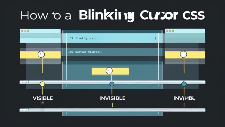
Creating a blinking cursor animation using CSS can add a professional touch to your website, making it more engaging and interactive. This effect is achieved through css blinking cursor animation, which can be customized to fit your website’s design. With css cursor effects, you can create a unique and attention-grabbing experience for your users.

In this article, we will explore the process of creating a blinking cursor animation using CSS, covering the basics of CSS animation and providing a step-by-step guide. Whether you’re a beginner or an experienced web developer, this article will provide you with the necessary knowledge to create this impressive effect using css blinking cursor animation and css cursor effects.

Introduction to CSS Animation

CSS animation is a powerful tool for creating dynamic effects on your website, including css blinking cursor animation. By using CSS, you can create a blinking cursor animation that is both visually appealing and engaging, using css cursor effects to enhance the user experience.

Key Takeaways

  • Learn how to create a blinking cursor animation using CSS
  • Understand the basics of CSS animation and its applications
  • Discover how to customize your blinking cursor animation using css cursor effects
  • Get a step-by-step guide on implementing css blinking cursor animation
  • Learn how to enhance user experience with css cursor effects and css blinking cursor animation
  • Explore the possibilities of CSS animation for creating dynamic effects

What is a Blinking Cursor Animation?

A blinking cursor animation is a visual effect that mimics the blinking of a cursor on a computer screen. This animation can be used to draw attention to a specific element on a webpage, such as a text input field or a button. To create such animations, developers often refer to css animation tutorial resources, which provide step-by-step guides on how to implement these effects.

Understanding the concept of a blinking cursor animation is crucial in creating an effective and engaging user interface. By incorporating css animation examples into their designs, developers can enhance the user experience and make their websites more interactive. A blinking cursor animation can be used to indicate that a text field is active or to prompt the user to enter information.

Understanding the Concept

The concept of a blinking cursor animation is simple yet effective. It involves creating a visual effect that mimics the blinking of a cursor, typically using CSS or JavaScript. This effect can be customized to fit the design and style of the website, making it a versatile tool for web developers.

Importance in UI Design

In UI design, a blinking cursor animation plays a significant role in creating an engaging and interactive user experience. It can be used to draw attention to specific elements on the webpage, such as buttons or text fields, and can help to guide the user through the website. By incorporating a blinking cursor animation into their design, developers can create a more dynamic and responsive user interface that enhances the overall user experience.

Benefits of Using CSS for Animation

When it comes to creating animations, CSS is a powerful tool that offers several benefits. One of the main advantages of using CSS for animation is that it provides a lightweight solution that can be easily integrated into your website. This is particularly important when creating a blinking cursor animation, as it requires a seamless and efficient animation that does not slow down the website.

Using CSS for animation also ensures browser compatibility, making it an ideal choice for creating cross-browser compatible effects. With CSS, you can create a css cursor animation code that works perfectly across different browsers and devices. Additionally, CSS animations are easy to customize and can be controlled using css animation keyframes tutorial, allowing you to create complex animations with ease.

Lightweight Solution

A lightweight solution is essential for creating fast and efficient animations. CSS animations are typically smaller in file size compared to other animation methods, making them ideal for websites that require fast loading times. This is particularly important for websites that have a lot of animations and interactive elements.

Browser Compatibility

Browser compatibility is another significant benefit of using CSS for animation. With CSS, you can create animations that work perfectly across different browsers and devices, including desktops, laptops, and mobile devices. This ensures that your website provides a consistent user experience across different platforms.

Benefits of CSS Animation Description
Lightweight Solution Fast and efficient animations that do not slow down the website
Browser Compatibility Animations that work perfectly across different browsers and devices
Customization Easily customizable using css animation keyframes tutorial

Setting Up Your HTML Structure

To create a blinking cursor animation, you need to start with a solid HTML foundation. This involves setting up a basic HTML structure that includes a text input field. The HTML structure is crucial as it provides the framework for your css blinking cursor animation to work seamlessly.

A basic HTML example would include a simple text input field, which can be created using the input tag. You can then use css cursor effects to customize the appearance and behavior of the cursor. For instance, you can use CSS to change the color, size, and style of the cursor.

Basic HTML Example

A simple HTML structure for a blinking cursor animation would include the following elements:

  • A container element, such as a div, to hold the text input field
  • A text input field, created using the input tag
  • CSS styles to customize the appearance and behavior of the cursor

Adding a Text Input

To add a text input field, you can use the input tag and specify the type as “text”. You can then use css blinking cursor animation to create a blinking effect on the cursor. This can be achieved by using the CSS animation property and defining a keyframe animation that changes the opacity of the cursor.

Creating the Blinking Animation with CSS

To create a blinking cursor animation, we need to understand the concept of keyframe animations. Keyframe animations allow us to define specific points in an animation and control the animation’s behavior at those points. This is particularly useful for creating complex animations like a blinking cursor.

A css animation tutorial can provide a step-by-step guide on how to create a blinking cursor animation using keyframe animations. By following a css animation tutorial, you can learn how to define the animation’s keyframes, set the animation’s duration, and control the animation’s timing.

Keyframe Animations Explained

Keyframe animations are defined using the @keyframes rule, which specifies the animation’s keyframes. Each keyframe defines a specific point in the animation, and the animation’s behavior at that point. For example, we can define a keyframe for the “on” state of the cursor, where the cursor is visible, and another keyframe for the “off” state, where the cursor is hidden.

Writing the CSS Code

To write the CSS code for a blinking cursor animation, we need to define the animation’s keyframes, set the animation’s duration, and control the animation’s timing. We can use css animation examples to get an idea of how to write the CSS code for a blinking cursor animation. Here is an example of how to define a blinking cursor animation using CSS:

Property Value
animation-name blink
animation-duration 1s
animation-timing-function linear

By following a css animation tutorial and using css animation examples, you can create a blinking cursor animation that enhances the user experience of your website or application.

Customizing Your Blinking Cursor

To take your blinking cursor animation to the next level, you can customize its appearance and behavior using various CSS properties. By adjusting the blink speed, changing the color, and modifying the size of the cursor, you can create a unique and engaging animation that enhances the user experience.

When working with css cursor animation code, it’s essential to understand how to use keyframe animations to create the desired effect. A css animation keyframes tutorial can provide valuable insights and examples to help you get started.

The blink speed of your cursor can be adjusted using the animation-duration property. For example, you can set the animation-duration to 0.5s to create a faster blink speed.

Changing Color and Size

To change the color and size of your cursor, you can use the color and font-size properties, respectively. For instance, you can set the color to blue and the font-size to 18px to create a larger, blue cursor.

  • Use the animation-duration property to adjust the blink speed
  • Use the color property to change the color of the cursor
  • Use the font-size property to modify the size of the cursor

By customizing your blinking cursor using css cursor animation code and following a css animation keyframes tutorial, you can create a unique and engaging animation that enhances the user experience and sets your website apart from others.

Integrating the Animation into Your Project

To integrate the css blinking cursor animation into your project, you’ll need to follow a few simple steps. This process involves adding the css cursor effects to your webpage, which can enhance the overall user experience.

First, ensure you have the necessary HTML and CSS files set up in your project. Then, you can start implementing the css blinking cursor animation by adding the relevant CSS code to your stylesheet.

Step-by-Step Implementation

  • Copy the CSS code for the blinking cursor animation and paste it into your stylesheet.
  • Update the HTML file to include the necessary classes or IDs for the animation to work.
  • Save both files and refresh your webpage to see the animation in action.

Testing for Compatibility

After implementing the css cursor effects, it’s essential to test your webpage for compatibility across different browsers and devices. This ensures that the css blinking cursor animation works smoothly and consistently, providing a seamless user experience.

Browser Device Compatibility
Google Chrome Desktop Compatible
Mozilla Firefox Mobile Compatible
Safari Tablet Compatible

Common Issues and Troubleshooting

When working with css animation tutorial, you may encounter some common issues that can hinder the performance of your blinking cursor animation. One of the most frustrating problems is a flickering cursor, which can be caused by incorrect css animation examples or browser compatibility issues.

To troubleshoot these issues, it’s essential to understand the basics of css animation tutorial and how to apply them correctly. Here are some common problems and their solutions:

  • Flickering cursor: Check your css animation examples for any errors or inconsistencies that may be causing the flicker.
  • Cross-browser concerns: Ensure that your css animation tutorial is compatible with different browsers and devices to avoid any issues.

By following these tips and using the right css animation examples, you can create a smooth and seamless blinking cursor animation that enhances the user experience. Remember to test your animation thoroughly to identify any potential issues and make the necessary adjustments to ensure a flawless performance.

Enhancing User Experience with Cursor Animation

To create an engaging and interactive user experience, it’s essential to consider the role of cursor animation in your website or application. A well-designed css cursor animation code can draw attention to specific elements, provide visual cues, and enhance overall usability. When implementing a blinking cursor animation, it’s crucial to balance aesthetics with functionality, ensuring that the animation is not distracting or overwhelming for users.

One way to achieve this balance is by following best practices for implementation, such as using a css animation keyframes tutorial to create smooth and consistent animations. Additionally, considering accessibility is vital to ensure that your animation is inclusive and usable for all users. This can be achieved by providing alternative methods for users to interact with your website or application, such as keyboard navigation or voice commands.

Accessibility Considerations

When designing a blinking cursor animation, it’s essential to consider the following accessibility considerations:

  • Provide alternative methods for users to interact with your website or application
  • Ensure that the animation is not distracting or overwhelming for users
  • Use high contrast colors to make the animation visible to users with visual impairments

Best Practices for Implementation

To ensure a seamless user experience, follow these best practices for implementing a blinking cursor animation:

  1. Use a consistent animation speed and style throughout your website or application
  2. Test the animation on different devices and browsers to ensure compatibility
  3. Provide clear and concise instructions for users to interact with the animation

Conclusion and Next Steps

In conclusion, creating a captivating CSS blinking cursor animation is a fantastic way to enhance the user experience on your website. We’ve covered the fundamentals, including understanding the concept, exploring the benefits of CSS animations, and providing step-by-step guidance on bringing your blinking cursor to life.

As you move forward, consider experimenting with different CSS cursor effects to find the perfect balance between aesthetics and functionality. Remember to prioritize accessibility and ensure your animations work seamlessly across various devices and browsers.

To further hone your skills, we recommend exploring additional CSS animation tutorials and resources available online. By continuously expanding your knowledge, you can elevate your web design and development capabilities, creating truly captivating user experiences.

FAQ

What is a blinking cursor animation?

A blinking cursor animation is a visual effect that mimics the blinking of a cursor on a computer screen. This animation can be used to draw attention to a specific element on a webpage, such as a text input field or a button.

Why is a blinking cursor animation important in UI design?

Understanding the concept of a blinking cursor animation is crucial in creating an effective and engaging user interface. This animation can enhance the user experience by providing a visual cue that draws attention to a specific element on the webpage.

What are the benefits of using CSS for animation?

CSS offers several benefits for creating animations, including a lightweight solution that can be easily integrated into your website and cross-browser compatibility with most modern browsers.

How do I set up the HTML structure for a blinking cursor animation?

To create a blinking cursor animation, you’ll need to set up a basic HTML structure with a text input field. This will provide the foundation for the CSS animation to be applied.

How do I create the blinking cursor animation with CSS?

To create the blinking cursor animation with CSS, you’ll need to use keyframe animations. This involves defining the different stages of the animation and specifying the desired changes in appearance over time.

How can I customize the blinking cursor animation?

You can customize the blinking cursor animation by adjusting the blink speed, changing the color, and modifying the size of the cursor. This allows you to create a unique and engaging animation that fits your specific needs.

How do I integrate the blinking cursor animation into my project?

To integrate the blinking cursor animation into your project, you’ll need to follow a step-by-step implementation process and ensure compatibility across different browsers and devices.

What common issues might I encounter with the blinking cursor animation?

Some common issues you may encounter include flickering cursor problems and cross-browser concerns. Fortunately, there are troubleshooting tips and solutions available to help you overcome these issues.

How can I enhance the user experience with a blinking cursor animation?

To enhance the user experience with a blinking cursor animation, it’s important to consider accessibility and implement best practices for implementation. This will ensure that the animation is not distracting or overwhelming for users.

Web design needs a smooth mix of HTML and CSS to make websites look great and work well. Knowing how to link CSS to HTML is key for developers at any level. It’s important whether you’re just starting out or have lots of experience.

Styling web pages means linking cascading stylesheets to HTML documents in different ways. You can use external, internal, or inline CSS methods. Each has its own role in web design and development.

Good stylesheet integration helps designers keep content and looks separate. This makes websites more flexible and easier to update. Linking CSS to HTML gives designers control over how a page looks and how it works on different devices.

Key Takeaways

  • There are many ways to connect CSS with HTML documents
  • Proper CSS linking boosts website design and function
  • Stylesheet integration supports responsive web development
  • Keeping content and design separate makes code easier to manage
  • Knowing how to link CSS is vital for today’s web designers

Understanding the Basics of CSS and HTML Connection

Web development is all about the partnership between HTML and CSS. Together, they form the base of modern web design. Each plays a key role in making digital experiences engaging.

HTML and CSS Integration Concept

The css html relationship is about structure and look. HTML gives a web page its basic shape and content. CSS, on the other hand, styles and arranges the visuals.

What Makes CSS and HTML Work Together

For HTML and CSS to work well together, you need to understand their roles. Here are the main points:

  • HTML builds the page’s structure and content
  • CSS takes care of the page’s look and layout
  • Stylesheets let developers control design precisely
  • They keep content separate from design

The Role of Stylesheets in Web Development

Stylesheets change web design by making visuals consistent and easy to scale. They let designers make changes quickly without touching the HTML.

HTML Function CSS Function
Content Structure Visual Styling
Define Elements Define Appearance
Semantic Markup Design Presentation

Core Concepts of HTML-CSS Integration

Developers use CSS selectors to style specific HTML elements. This method allows for detailed designs with less code.

Web developers have several ways to link CSS to HTML. Each method has its own strengths and when to use them. Knowing these helps make web designs flexible and efficient.

CSS HTML Linking Methods

Let’s dive into each method to help you pick the best for your project.

Method Complexity Recommended Use
External Stylesheet Low Large websites, multiple pages
Internal CSS Medium Single page styling
Inline CSS High Specific element customization

Each way to add CSS to HTML has its own benefits. External stylesheets are great for big sites. Internal CSS is good for small projects. Inline CSS is useful for styling specific elements but can get messy.

Choosing the right method is key. It depends on your project’s needs, like how big it is, how fast it needs to be, and how organized the code should be.

External Stylesheet: The Professional Approach

Web developers often pick external stylesheets for their advanced method of adding CSS to HTML. This method keeps design and content separate. It makes web projects cleaner and easier to handle.

External CSS files bring big benefits for linking CSS with HTML, especially in complex projects. By keeping stylesheets separate, developers can organize code better and work more flexibly.

Benefits of Using External CSS Files

  • Improved website performance
  • Enhanced code reusability
  • Simplified maintenance
  • Faster page load times
  • Consistent design across multiple pages

File Organization Best Practices

Professional web developers use certain strategies for organizing external CSS files. They keep a logical directory structure. This makes the development process smoother.

Practice Description
Modular Design Create separate CSS files for different design components
Naming Convention Use clear, descriptive file names
Folder Structure Organize files in dedicated CSS directories

Directory Structure Recommendations

  1. Create a dedicated css folder in your project
  2. Use subdirectories for complex projects
  3. Implement consistent file naming
  4. Separate global and component-specific stylesheets

By using these external stylesheet strategies, developers can make web applications more scalable and easy to maintain. They ensure efficient CSS integration.

Internal CSS: Style Tags in HTML Documents

Internal CSS is a way to mix css with html by adding style rules right in the HTML. It’s great for small web projects or single-page sites. Here, you don’t need to manage many stylesheet files.

Developers put style definitions in <style> tags in the <head> section. This method lets you change how a webpage looks quickly. You don’t need to make separate stylesheet files.

  • Ideal for quick styling solutions
  • Simplifies small project development
  • Reduces external file dependencies

Internal CSS lets developers target HTML elements with selectors. You define rules right in the HTML. This makes styling easier for simple web designs.

Example of internal CSS implementation:

<head>
<style>
body {
background-color: #f4f4f4;
}
h1 {
color: navy;
}
</style>
</head>

Internal CSS is great for small projects but not for big sites. It’s best for quick prototypes or special page designs. For bigger sites, it’s better to use external stylesheets.

Inline CSS: Direct Element Styling

Inline CSS is a special way to style web elements right in the HTML code. It’s used when quick, specific styling is needed without making separate CSS files. Knowing how to use inline styles can help with targeted design solutions.

When to Use Inline Styles

Inline CSS is useful in certain situations:

  • Rapid prototyping and testing design changes
  • Overriding external stylesheet properties
  • Generating dynamic styles through JavaScript
  • Creating unique, one-time style modifications

Limitations of Inline CSS

Inline styles are quick fixes but have big downsides:

Limitation Impact
Reduced Maintainability Difficult to manage multiple styles
Performance Overhead Increases page load time
Code Complexity Makes HTML less readable
Specificity Challenges Hard to override with external stylesheets

Developers should use inline CSS carefully. It’s not ideal for big web design projects. External and internal CSS methods are usually better for scalability and maintenance.

Connecting CSS to HTML is key for web developers. It’s easy when you know the basics. There are many ways to link CSS to HTML, each for different needs.

  1. Create your CSS file with a .css extension
  2. Determine your preferred linking method
  3. Add the right link or style tag to your HTML document
  4. Check if the connection works

Now, let’s look at the most common ways to link:

External Stylesheet Method

The external stylesheet is best for big projects. You’ll use the <link> tag in the HTML <head> section.


<head>
<link rel="stylesheet" href="styles.css">
</head>

Key Considerations for HTML CSS Linking

Method Best Use Case Performance Impact
External Stylesheet Large, complex websites Minimal, cacheable
Internal CSS Single page applications Moderate loading time
Inline CSS Specific element styling Highest performance overhead

Using the right CSS to HTML linking makes your web pages look great everywhere.

Common Issues When Connecting Stylesheets

Web developers often face challenges when linking CSS to HTML. It can feel like solving a puzzle. Knowing common problems helps fix issues quickly.

Identifying Path Problems

Incorrect file paths are a big reason CSS files don’t link to HTML. Developers must check directory structures and file locations carefully.

  • Check absolute vs. relative file paths
  • Verify file extension accuracy
  • Confirm case sensitivity in file names

Browser Cache Complications

Cached browser data can stop stylesheet updates from showing. Developers need ways to handle browser caching.

Caching Strategy Implementation Method
Hard Refresh Ctrl+F5 (Windows) or Cmd+Shift+R (Mac)
Disable Cache Browser Developer Tools
Version Appending Add query string to CSS link

Syntax Error Resolution

Syntax mistakes can break the link between HTML and CSS. Developers should check their code for errors like missing brackets or wrong selector formatting.

  1. Validate CSS syntax
  2. Use browser developer tools
  3. Check for missing semicolons
  4. Ensure proper selector syntax

Understanding common challenges helps developers improve their web development. They can make websites more robust and visually consistent.

Multiple Stylesheet Management

Managing multiple CSS files in a web project needs careful planning. When combining CSS with HTML, developers must know how to link two CSS files. This involves organizing files well and understanding how stylesheets work together.

Professional web developers use many stylesheets to keep code clean and organized. Here are some key strategies for managing CSS files:

  • Create separate CSS files for different design components
  • Use link tags to connect multiple stylesheets
  • Understand CSS rule specificity and inheritance
  • Implement a logical file naming convention

When linking two CSS files to HTML, the order of link tags is important. CSS rules are applied from top to bottom. This means later stylesheets can change earlier ones. This gives developers control over design elements.

Stylesheet Type Use Case Recommended Practice
Global Styles Site-wide design Load first in HTML
Component Styles Specific page elements Load after global styles
Responsive Styles Media queries Load last for proper cascading

By using these methods, developers can make web designs more maintainable and scalable. They can effectively combine CSS with HTML.

CSS Import Rules and @import Syntax

Web developers look for ways to import CSS into HTML efficiently. The @import rule is a great method. It lets one stylesheet load another directly in your CSS code.

  • Using @import within a CSS file
  • Embedding @import directly in HTML stylesheet links

Understanding @import Functionality

The @import rule helps manage stylesheets better. It lets developers create separate CSS files. Then, they can import these into a main stylesheet.

Advantages of Using @import

  1. Improved code organization
  2. Easier stylesheet maintenance
  3. Enhanced modularity in design systems

Performance Considerations

While @import is flexible, it can slow down page loading. Browsers download imported stylesheets one after another. This can make pages take longer to load.

It’s best to use @import wisely and explore other ways to load styles for better website speed.

Media Queries and Conditional Stylesheets

Media queries are key in the css html relationship. They help make web designs responsive. They adjust styles based on screen size, resolution, and orientation.

Media queries work by applying different styles under certain conditions. This makes sure websites look good on all devices.

  • Screen width breakpoints
  • Device orientation detection
  • Resolution-specific styling
  • Aspect ratio adjustments

To use media queries, developers add the @media rule in CSS. They can target specific device features with ease. For instance:

@media screen and (max-width: 600px) {
.container {
flex-direction: column;
}
}

Responsive design uses media queries for fluid layouts. These layouts adjust well on smartphones, tablets, and desktops. The css html relationship becomes dynamic, making content adapt smartly.

  1. Define breakpoints strategically
  2. Use flexible grid systems
  3. Test across multiple devices
  4. Optimize performance

Today’s web development needs flexible, responsive designs. Media queries are essential in linking css with html. They help developers create experiences that look great on all devices.

Best Practices for CSS-HTML Integration

Creating seamless html css integration needs careful planning. Professional web developers know that clean stylesheets are key. They help keep web projects scalable and efficient.

Good css link html strategies involve several important points. These can greatly improve code quality and make it easier to maintain.

Code Organization Tips

  • Use consistent naming conventions for classes and IDs
  • Organize CSS files by component or page section
  • Implement a modular CSS architecture
  • Leverage CSS preprocessors like Sass or Less

Maintenance Strategies

  1. Create a systematic file structure
  2. Use comments to explain complex styling rules
  3. Implement version control for stylesheet management
Strategy Benefits Implementation Difficulty
Modular CSS Improved reusability Medium
Preprocessor Usage Enhanced code organization High
Consistent Naming Better readability Low

By focusing on clean code principles and strategic stylesheet management, developers can create more maintainable and scalable web projects. These projects can easily adapt to changing design needs.

CSS Preprocessors and HTML Integration

CSS preprocessors have changed how developers work with CSS and HTML. They add advanced features that regular CSS doesn’t have.

Tools like Sass and Less make CSS better with programming-like features. They help developers write stylesheets that are more efficient and easier to keep up with.

  • Create reusable variables for consistent styling
  • Implement nested selector structures
  • Use mixins for complex CSS patterns
  • Generate dynamic style calculations

Preprocessors offer many benefits:

Feature Benefit
Variables Simplify color and spacing management
Nesting Reduce code repetition
Mixins Create reusable style components

Preprocessors turn into standard CSS, making it easy to work with HTML. Developers can use these tools to make stylesheets more complex and easier to manage.

Working with preprocessors means writing enhanced CSS files. These are then turned into standard CSS files that link to HTML documents. This method gives developers strong styling options while keeping things compatible with browsers.

Modern CSS Loading Techniques

Web developers are always looking for new ways to link CSS to HTML. They want to make websites load faster and look better. The way we load stylesheets has changed a lot.

Today, web development needs fast ways to add CSS to HTML. This makes websites load quicker and work better for users. Now, developers have smart ways to make stylesheets work smoothly.

Async and Defer Loading Strategies

Async and defer loading are key for better CSS loading:

  • Async loading lets stylesheets load on their own, without slowing down the page.
  • Defer loading waits until important page content loads before adding CSS.
  • Both methods help websites load faster at first.

Performance Optimization Methods

There are advanced ways to make CSS load better:

  1. Critical CSS extraction – focuses on styles for the top part of the page.
  2. Lazy loading of stylesheets that aren’t needed right away.
  3. Reducing the number of things that slow down the page.
Loading Technique Performance Impact User Experience
Async Loading Reduced initial load time Faster perceived page speed
Defer Loading Optimized resource management Smoother content display
Critical CSS Minimal initial rendering overhead Instant visual feedback

Using these modern techniques, developers can make websites load faster. They also keep the CSS code clean and efficient.

Cross-Browser Compatibility Considerations

Developers often face challenges with cross-browser compatibility when linking HTML and CSS. Different browsers interpret CSS and HTML in unique ways. This can cause unexpected design variations.

To ensure consistent styling, developers use several strategies:

  • Use vendor prefixes for CSS properties needing special browser support
  • Implement feature detection techniques
  • Validate CSS files to prevent css file not linking to html issues
  • Test stylesheets across multiple browser versions

Managing browser compatibility involves several key strategies:

  1. Utilize CSS reset stylesheets to normalize default browser styles
  2. Implement responsive design principles
  3. Use modern CSS frameworks with built-in cross-browser compatibility

When fixing css file not linking to html problems, developers should check:

  • Correct file path references
  • Proper syntax in link tags
  • Browser developer tools for potential errors

Modern web development tools like Autoprefixer and CSS validation services help a lot. They make creating cross-browser compatible stylesheets easier. This reduces potential rendering inconsistencies.

Conclusion

Web development needs a deep understanding of linking CSS to HTML. This guide shows many ways to do this, from using external stylesheets to inline methods. Each method has its own benefits for making web pages look great and work well.

Knowing how to link CSS ID to HTML is key for targeted styling. Developers can choose from external, internal, or inline CSS based on their project needs. The goal is to pick the best method for performance, ease of use, and design flexibility.

Modern web development requires careful stylesheet integration. By following the best practices in this article, developers can make stylesheets that are clean, organized, and grow with the site. Keeping up with new CSS methods and practicing these techniques will help web professionals build better websites.

As web technologies change, it’s important to stay current with CSS integration. By practicing, trying new things, and understanding how stylesheets work, developers can make web pages that are both dynamic and visually appealing. This meets today’s design standards.