Tag

Front-End Development

Browsing

Ever wonder how websites go from plain text to amazing digital experiences? At the core of web development are HTML and CSS. These two languages might seem alike at first, but they have very different roles in making websites.

HTML (Hypertext Markup Language) is the backbone, setting up the content and basic layout of web pages. CSS (Cascading Style Sheets) brings that structure to life by controlling how it looks, including colors and spacing.

HTML is like the skeleton of a website, giving it the basic shape. CSS is like the skin and clothes, making it look and feel good to users. Together, they make the web experiences we use every day.

Key Takeaways

  • HTML provides website structure and content
  • CSS manages visual design and presentation
  • Both languages are essential for modern web development
  • HTML defines content, CSS defines appearance
  • Understanding their differences is crucial for web designers

Understanding the Foundation of Web Development

Web development is a fast-paced field where styling websites and using CSS are key. Developers use basic technologies to make web pages that grab users’ attention. These pages work smoothly and are easy to use.

Today’s websites use advanced tools to turn simple data into stunning digital experiences. These tools work together to make websites that are easy to use and look great.

The Building Blocks of Modern Websites

Web development relies on two main languages:

  • HTML: Provides the basic structure
  • CSS: Makes websites look good
  • JavaScript: Adds interactivity

How Web Browsers Interpret Code

Web browsers take CSS and HTML and turn them into what we see on our screens. They go through a detailed process to show us content, apply designs, and make things interactive.

The steps they take include:

  1. Reading the HTML structure
  2. Applying CSS designs
  3. Showing visual elements
  4. Handling JavaScript actions

Knowing these basic technologies helps developers make websites that are modern, responsive, and meet today’s digital standards.

What is CSS and Its Role in Web Design

Cascading style sheets (CSS) are key in web development. They change how websites look and feel. CSS is a styling language that lets web designers separate how a page looks from its content.

The main job of CSS is to control the look of web pages. It handles layout, colors, fonts, and more. CSS gives developers detailed control over how web pages look, unlike raw HTML.

  • Enables consistent design across multiple web pages
  • Reduces website maintenance complexity
  • Improves website loading speed
  • Supports responsive design techniques

Web designers use CSS to make websites look great. They set rules for how elements should look. These rules can apply to whole sites, specific pages, or just certain elements.

CSS Feature Design Impact
Layout Control Precise positioning of webpage elements
Color Management Consistent color schemes across pages
Responsive Design Adaptable layouts for different screen sizes

Modern web development relies heavily on cascading style sheets. They create dynamic, visually engaging websites. These websites work well on various devices and platforms.

The Core Functions of HTML in Website Structure

HTML is the base for building websites and organizing digital content. Web developers use HTML to set up the basic structure of web pages. This structure helps in presenting content clearly and logically.

Knowing how HTML works is key to making websites better and more accessible. It offers a way to organize web content using different elements and tags.

HTML Elements and Tags

HTML elements are the main parts of a webpage that define its content. Each element is important for organizing and styling the website:

  • Heading tags (h1-h6) for defining content hierarchy
  • Paragraph tags for text blocks
  • Div and span tags for grouping and styling content
  • Semantic tags like header, nav, and footer

Document Object Model (DOM)

The Document Object Model shows how HTML documents are structured. It’s a tree-like structure that browsers use to display web pages. This structure helps in applying css properties effectively.

DOM Component Function
Root Element Top-level HTML structure
Parent Elements Contains child elements
Child Elements Nested within parent elements

Semantic HTML Benefits

Semantic HTML adds meaning to web content, making it more accessible and SEO-friendly. Using descriptive tags helps in creating websites that are easier to use and understand. This also supports better css properties implementation.

  • Improved screen reader compatibility
  • Better search engine indexing
  • More consistent website styling
  • Enhanced code readability

Cascading Style Sheets: Bringing Design to Life

Cascading style sheets change web design by making HTML look amazing. They let developers control how web pages look, making designs complex yet simple to code.

Web designers use cascading style sheets to make web pages look good and work well. These tools help control:

  • Color and typography
  • Layout and positioning
  • Interactive element styling
  • Screen responsiveness

The cascading part of CSS means styles can build on each other. This makes designing flexible. Developers can use styles in different ways – inline, internal, or external – for detailed styling.

Today’s web design depends a lot on advanced CSS techniques. Designers can now make complex layouts, smooth animations, and ensure websites look the same on all devices.

Tools like flexbox and grid systems have changed how web layouts are made. They help developers create detailed, responsive designs easily and accurately.

How HTML and CSS Work Together

Web development is all about HTML and CSS working together. They make websites look great and work well. Knowing how they work together is key for making websites stylish and easy to use.

There are many ways to mix CSS with HTML. Each method is good for different things. Here are the main ways:

  • Inline Styles
  • Internal Stylesheets
  • External Stylesheets

Integration Methods

CSS lets developers add styles in three main ways:

Method Description Best Use Case
Inline Styles Directly applied to individual HTML elements Quick, one-off style modifications
Internal Stylesheets Styles defined within HTML document’s <style> tag Single-page website styling
External Stylesheets Separate .css files linked to HTML Large, multi-page websites

Best Practices for Code Organization

Keeping code clean and organized is vital. Developers should:

  1. Use consistent naming conventions
  2. Group related CSS rules
  3. Comment complex style definitions
  4. Minimize CSS specificity

By sticking to these tips, web developers can make websites that are easy to update and grow. This lets them use HTML and CSS to their fullest potential.

CSS Syntax and Selectors Explained

CSS syntax is key to web styling, making websites look great. It’s important to know about css selectors. They help developers target specific HTML elements and apply design rules.

https://www.youtube.com/watch?v=XHkIU8Wom2Q

  • Selector: Identifies the HTML element to style
  • Property: Specifies the style characteristic
  • Value: Defines the specific styling detail

CSS selectors have different types, each with its own way of targeting elements:

Selector Type Example Usage
Element Selector p { color: blue; } Targets all paragraph elements
Class Selector .highlight { background: yellow; } Targets elements with specific class
ID Selector #header { font-size: 24px; } Targets unique element with specific ID

Advanced css selectors like descendant and pseudo-selectors offer more precise targeting. These tools help developers create detailed and responsive designs.

  • Descendant Selector: Targets nested elements
  • Pseudo-class Selectors: Style based on state
  • Attribute Selectors: Target elements with specific attributes

Understanding css syntax and selectors turns simple HTML into stunning web pages. It gives developers the power to create amazing designs.

The CSS Box Model and Layout Systems

Web designers use the css box model as a key concept for making layouts. It helps them create websites that look good and work well on different devices.

The css layout has important parts that affect how elements fit on a webpage. Each HTML element is seen as a box with properties that control its size and spacing.

Understanding Margins and Padding

In the css box model, two key spacing properties are important:

  • Margin: Adds space outside an element’s border
  • Padding: Adds space inside an element, between content and border

Flexbox and Grid Layouts

Modern css layout tools offer powerful ways to design:

Layout System Key Features Best Use Cases
Flexbox One-dimensional alignment Responsive navigation, card layouts
CSS Grid Two-dimensional layout control Complex page structures, magazine-style designs

These advanced css layout tools help developers make complex, flexible web designs easily.

HTML Structure vs CSS Presentation

Web development is all about separating content from design. HTML sets up the website’s structure. CSS, on the other hand, focuses on styling and looks. This split makes it easier to build flexible and easy-to-maintain websites.

HTML and CSS have different jobs:

  • HTML defines the content structure
  • CSS controls the visual representation
  • CSS properties enable dynamic website styling

This separation gives developers a lot of design freedom. CSS lets them change how a website looks quickly, without touching the HTML. This makes it easier to keep websites up-to-date and supports designs that work well on any device.

HTML Role CSS Role
Content Organization Visual Styling
Semantic Markup Layout Design
Document Structure Color and Typography

Knowing how HTML and CSS work together helps web experts make better websites. These websites are not just pretty but also work well for everyone who visits.

Advanced CSS Features and Animations

Web designers always look for new ways to make websites more engaging. They use CSS animations and properties to turn simple pages into interactive wonders.

CSS Animations Visualization

Today’s web design needs advanced css properties for smooth, complex visuals. These tools help developers make stunning interfaces without JavaScript.

Transitions and Transforms

CSS transitions make property changes smooth, improving user interaction. Important transition features include:

  • Duration of animation
  • Timing function
  • Delay before starting
  • Property to be transformed

Transforms let developers change elements by scaling, rotating, skewing, and translating. They can make cool visual effects with just a few css lines.

Keyframe Animations

Keyframe animations are the top of css animations. They let developers control detailed motion sequences at different animation stages.

Animation Type Key Features Use Case
Linear Animation Consistent speed Simple movements
Ease Animation Gradual acceleration/deceleration Natural motion effects
Bounce Animation Elastic-like movement Interactive elements

Learning these advanced css animations helps web designers create engaging, interactive websites. These sites capture users’ attention and improve website interaction.

Common Challenges When Working with HTML and CSS

Web developers often face problems when styling websites and learning CSS. Knowing these issues helps make web designs better and more efficient.

Developers meet several big challenges when working with HTML and CSS:

  • Cross-browser compatibility issues
  • Responsive design complexities
  • CSS specificity and inheritance problems
  • Performance optimization

Browser compatibility is a big problem in website styling. Different browsers see CSS in their own ways, leading to layout issues. This means developers must test and find specific fixes.

Challenge Impact Solution
Browser Differences Inconsistent Layout Use Vendor Prefixes
Responsive Design Breakpoint Management Flexbox/Grid Layouts
CSS Performance Slow Page Load Minimize Selectors

Debugging CSS needs smart strategies. Developers should use browser tools, know about selector specificity, and write clean, organized code. This helps avoid problems.

Styling websites well means always learning and keeping up with new web standards and browser tech.

Web developers use css frameworks to make styling websites easier and faster. These tools give them pre-written CSS code. This helps speed up development and keeps designs consistent on all platforms.

Today’s css frameworks help developers create complex web designs quickly. They save time by not having to write the same styling code over and over. This also cuts down on mistakes.

Bootstrap: A Comprehensive Framework

Bootstrap is a top choice for styling websites with css. It offers:

  • Responsive grid system
  • Pre-designed components
  • Mobile-first approach
  • Extensive documentation

Foundation: Flexible Design Framework

Foundation is another strong option for web developers. It’s known for:

  • Advanced responsive capabilities
  • Customizable components
  • Robust cross-browser compatibility
  • Accessibility features

Tailwind CSS: Utility-First Approach

Tailwind CSS takes a different path with its utility classes. Developers can build custom designs right in their HTML. This makes styling websites more straightforward and efficient.

Choosing the right css framework depends on several factors. These include project needs, team skills, and design goals. Each framework has its own benefits that can greatly improve web development.

Responsive Design: HTML Structure and CSS Media Queries
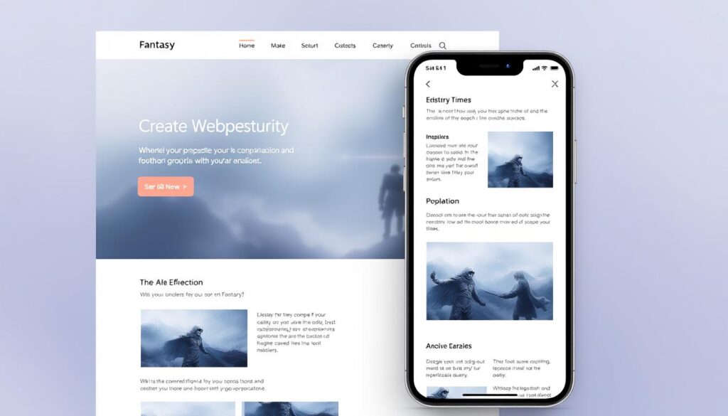
Responsive Web Design Layout

Responsive design makes websites work well on all devices. Web developers use css layout to make sites look great on phones, tablets, and computers.

The heart of responsive design is based on three main ideas:

  • Fluid grid systems
  • Flexible images
  • CSS media queries

Media queries are key CSS tools. They let developers change styling based on device features. These queries help websites adjust layout, font sizes, and content for different screens.

Important steps for responsive design include:

  1. Using percentage-based widths instead of fixed pixels
  2. Starting with a mobile-first design
  3. Employing CSS flexbox and grid for flexible layouts

Developers mix HTML structure with smart CSS media queries for a smooth experience. This way, websites look good and work well on all screens.

The web’s future relies on responsive design. It focuses on making websites easy to use and accessible on many devices.

Browser Compatibility and Cross-Platform Considerations

Web developers have a big challenge. They need to make websites look good on all browsers and devices. CSS properties are key to making sure users have a smooth experience everywhere.

To solve this problem, developers use a few important strategies:

  • Implementing CSS resets to normalize default browser styles
  • Using vendor prefixes for experimental CSS properties
  • Leveraging feature detection techniques
  • Writing clean, standardized CSS code

Modern web development means knowing how browsers handle CSS. Browsers like Chrome, Firefox, Safari, and Edge can show websites differently. So, testing on many platforms is crucial.

Developers use tools and techniques to fix these issues:

  1. Browser compatibility testing platforms
  2. Responsive design frameworks
  3. CSS preprocessors like SASS and LESS
  4. Automated testing scripts

With strong styling strategies, developers can make websites that work well on many platforms and browsers.

Conclusion

Web development is all about HTML and CSS working together. CSS makes web pages look great. HTML sets up the basic structure of web content.

Knowing how HTML and CSS work together helps developers make websites that work well on any device. HTML is for the content, and CSS is for how it looks. Web designers who get this can make websites that are easy to use and fun to explore.

The world of web development keeps changing, but HTML and CSS are still key. Developers need to keep up with new trends and ways to make websites look good. By always learning and trying new things, they can make websites that are ahead of the curve.

HTML and CSS will always be important as web tech gets better. Both new and experienced developers should keep learning about these languages. Being able to write code that looks good and works well is a skill that will always be in demand.

FAQ

What is the fundamental difference between HTML and CSS?

HTML (Hypertext Markup Language) sets up the structure and content of a web page. CSS (Cascading Style Sheets) handles the look and layout. HTML is the skeleton, and CSS is the skin.

How do CSS selectors work?

CSS selectors pick and style specific HTML elements. They can target elements by type, class, ID, or attributes. For example, `.header` selects all “header” class elements, while `#main-title` picks the “main-title” ID element.

What is the CSS box model?

The CSS box model shows how HTML elements are rendered. It has four layers: content, padding, border, and margin. The content area holds the content, padding adds space inside, border surrounds it, and margin adds space outside.

What are the different ways to include CSS in a webpage?

You can include CSS in three ways:
1. Inline Styles: Use the `style` attribute on HTML elements
2. Internal Stylesheet: Add a “ tag in the HTML “ section
3. External Stylesheet: Link an external .css file with the “ tag in the HTML “

External stylesheets are best for organization and upkeep.

What is the purpose of CSS media queries?

CSS media queries change styles based on device features like screen size. They’re key for responsive designs that work on all devices.

How do flexbox and grid differ in CSS layout?

Flexbox is for one-dimensional layouts, great for component layouts. CSS Grid is for two-dimensional layouts, perfect for page layouts. Grid is better for complex designs, while flexbox is good for simple layouts.

What are CSS preprocessors?

CSS preprocessors like Sass and Less extend CSS. They offer features like variables and nested rules. These are then compiled into standard CSS for browser use.

Why is browser compatibility important in CSS?

Browser compatibility ensures web pages work the same on all browsers and devices. Developers use techniques like vendor prefixes to make pages look the same everywhere.

What are CSS animations?

CSS animations create interactive effects without JavaScript. They use `@keyframes` and the `animation` property. Animations can change colors, move, and scale, making interfaces more engaging.

What is the cascading nature of CSS?

The “cascading” in CSS means how styles are applied and prioritized. Styles are applied in order: inline styles first, then internal stylesheets, and finally external stylesheets. Specificity and importance also play a role.

Web design has changed a lot with CSS (Cascading Style Sheets). It’s a powerful tool that makes digital interfaces come alive. CSS is like a blueprint for how web pages look and feel. It works with HTML to create amazing digital experiences.

Developers use CSS to control things like colors and layouts. It’s different from HTML because CSS keeps design separate from content. This makes web development more flexible and efficient.

Think of CSS as a digital painter’s palette. It lets web designers create perfect visual experiences on any device. It gives control over things like typography, spacing, and how elements interact. This makes websites more engaging and easy to use.

Key Takeaways

  • CSS controls visual presentation of web content
  • Enables separation of design from structural HTML
  • Supports responsive and adaptive web design
  • Allows consistent styling across multiple web pages
  • Reduces website maintenance complexity

Understanding CSS: The Foundation of Web Design

Web design has changed a lot since the early internet days. CSS (Cascading Style Sheets) is a key technology that changed how web pages are made and styled. So, what is CSS? It’s a styling language that keeps the look of a web page separate from its content.

CSS Web Design Evolution

The Evolution of Web Styling

Before CSS, web designers had few styling options. HTML alone couldn’t give the design flexibility needed for today’s websites. CSS changed everything, giving developers more control over web page design.

  • 1990s: HTML used for both structure and styling
  • 1996: CSS Level 1 introduced
  • 2000s: Widespread adoption of CSS techniques
  • 2010s: Advanced responsive design capabilities

Why CSS Matters in Modern Web Development

CSS is key for making websites look good and work well on all devices. Web developers use CSS to make sure designs look the same everywhere. It helps control layout, colors, spacing, and animations, making CSS essential for web development today.

CSS Benefit Impact on Web Design
Responsive Design Adapts to different screen sizes
Performance Reduces page load times
Consistency Maintains uniform design across platforms
Flexibility Easy to update and modify designs

Knowing about CSS and its properties helps developers make web sites that are dynamic and engaging. These sites meet the changing needs of digital communication.

What is CSS: Core Concepts and Fundamentals

CSS (Cascading Style Sheets) is a key tool for making web pages look great. It helps web designers control how websites look, including layout, colors, and fonts. This makes websites more attractive and user-friendly.

CSS Styling Fundamentals

Learning about CSS means knowing its main roles in web design. It separates design from HTML content, giving more control over how websites look.

Primary Uses of CSS

  • Page Layout Design: Positioning and structuring web page elements
  • Visual Styling: Controlling colors, fonts, and spacing
  • Responsive Design: Adapting websites to different screen sizes
  • User Interface Enhancement: Creating interactive visual experiences

Key CSS Properties

CSS Property Function Example Usage
color Text color color: blue;
background-color Element background background-color: #f0f0f0;
font-size Text size font-size: 16px;
margin Element spacing margin: 10px;

Web developers use CSS to make websites look good and work well. By knowing these basics, designers can make websites that are both beautiful and easy to use. This is true for all kinds of devices.

The Three Types of CSS Implementation

Web developers use different ways to add CSS to web pages. Each method has its own strengths and when to use them. Knowing these helps make web designs better and easier to keep up.

  • Inline CSS
  • Internal CSS
  • External CSS

Inline CSS

Inline CSS styles HTML elements directly with the style attribute. It puts the CSS right in the HTML tag. This makes styling one element easy and fast.

Here’s an example of inline CSS:

<div style="color: blue; font-size: 16px;">Styled Text</div>

Internal CSS

Internal CSS uses a style tag in the HTML document’s head. It lets you style many elements on one page. The CSS is kept in the document itself.

Here’s an example of internal CSS:

<style>
div {
color: green;
margin: 10px;
}
</style>

External CSS

External CSS creates a separate .css file linked to HTML pages. It’s the most flexible and scalable way. It keeps styles consistent across many pages.

Here’s an example of linking to an external CSS file:

<link rel="stylesheet" href="styles.css">

Choosing the best CSS method depends on the project’s needs. It also depends on how complex it is and what design goals you have.

Is CSS a programming language?

Many developers wonder if CSS is a programming language. CSS, or Cascading Style Sheets, is actually a style sheet language. It’s not like traditional programming languages. It focuses on the visual look and layout of web pages.

CSS can’t do complex tasks or calculations like programming languages do. Its main job is to make web content look good and arrange it properly. It gives instructions to web browsers on how to display the content.

  • Defines visual presentation
  • Controls page layout
  • Manages design elements
  • Creates responsive interfaces

CSS uses a declarative syntax. This means it tells browsers how to show elements without using complex programming. Web developers use CSS to make HTML look better and more appealing.

Programming Language CSS Characteristics
Complex Logic Visual Styling Rules
Computational Processing Design Instructions
Variable Manipulation Presentation Configuration

Even though CSS isn’t a traditional programming language, it’s very important for web development. It helps create beautiful and interactive web experiences.

CSS Syntax and Structure Explained

For web developers, knowing CSS syntax is key. It helps in making websites look good and work well. CSS lets designers turn simple HTML into something visually stunning.

A typical CSS syntax has three main parts:

  • Selector: Finds the HTML element to style
  • Property: Shows what style to apply
  • Value: Tells how to style it

The basic CSS structure is straightforward. It starts with a selector, then curly braces with property-value pairs. Each part ends with a semicolon for clear code.

Let’s dive into the details of CSS syntax:

Component Description Example
Selector Targets HTML elements p, .class, #id
Property Styling characteristic color, font-size, margin
Value Specific style setting red, 16px, 10px

Web developers use CSS syntax to make websites look great and work well. By knowing these rules, designers can create complex styles with ease and flair.

Essential CSS Selectors for Effective Styling

CSS selectors are powerful tools for web developers. They help target and style specific elements on a webpage. Knowing different types of css selectors can make your web designs cleaner, more efficient, and responsive.

Web developers have many css selectors to choose from. Each one has its own purpose in styling web pages. These methods let developers apply styles exactly where they need them.

Class and ID Selectors

Class and ID selectors are key for targeting elements. Here’s how they work:

  • Class Selectors (.classname): Apply styles to multiple elements
  • ID Selectors (#idname): Target unique, individual elements
  • They’re great for specific styling and JavaScript manipulation

Element and Attribute Selectors

Element and attribute css selectors offer more control over styling:

  • Element Selectors (p, div, span): Target all elements of a specific type
  • Attribute Selectors ([attribute]): Style elements based on their attributes
  • They help create consistent design across different elements

Pseudo-class and Pseudo-element Selectors

Pseudo-classes and pseudo-elements are advanced css selectors. They offer dynamic styling options:

  • Pseudo-classes (:hover, :active): Style elements based on state
  • Pseudo-elements (::before, ::after): Create decorative content
  • They enhance user interaction and visual design

Mastering these css selectors will help developers create more sophisticated and responsive web designs.

Understanding the CSS Box Model

The CSS box model is key in web design. It shows how elements are placed on a webpage. Each HTML element is seen as a box with parts that affect its layout and spacing.

The CSS box model has four main parts that affect an element’s size and spacing:

  • Content: The actual text or media inside the element
  • Padding: Clear space between content and border
  • Border: A visible or invisible boundary around the content
  • Margin: Space outside the border that separates elements

Knowing how these parts work together is vital for making accurate layouts. The box-sizing property is important for figuring out element sizes.

Box Model Component Purpose Impact on Layout
Content Displays actual element content Determines core element size
Padding Creates internal spacing Increases element’s inner space
Border Defines element boundary Adds visual separation
Margin Creates external spacing Separates elements from each other

Web developers can change these CSS box model properties to make complex and flexible designs. Knowing the box model well lets them control element spacing and layout precisely.

CSS Layout Techniques and Positioning

Modern web design needs layouts that work well on all devices. CSS layout techniques have changed how we make websites look good and work well. Knowing these techniques is key for making professional and flexible web sites.

Web developers now have tools to shape page structure and where elements go. These advanced css layout systems give great control over design and how it looks on different screens.

Flexbox Layout System

Flexbox is a big change in css layout management. It’s a one-dimensional layout that lets developers space out and align content with great accuracy.

  • Enables flexible container arrangements
  • Supports dynamic content sizing
  • Simplifies complex alignment challenges

Grid Layout System

CSS Grid is a two-dimensional layout system that offers advanced css layout features. It lets developers make complex grid-based designs with just a little code.

Grid Feature Description
Rows and Columns Create precise structural layouts
Responsive Design Adapt layouts across different screen sizes
Flexible Sizing Control element dimensions dynamically

Positioning Properties

CSS positioning properties give detailed control over where elements go. Developers can place elements exactly using static, relative, absolute, and fixed positioning.

  • Static: Default positioning
  • Relative: Position relative to normal flow
  • Absolute: Position independent of document flow
  • Fixed: Position relative to browser window

Mastering CSS Colors and Typography

CSS properties are key to making web designs pop. Knowing how to use colors and typography can turn a simple page into something amazing. Web designers use these skills to make digital spaces that grab your attention.

Choosing colors is a big part of web design. Developers use different css properties and models to pick colors:

  • RGB (Red, Green, Blue) color model
  • Hexadecimal color codes
  • HSL (Hue, Saturation, Lightness) color system

Typography css properties let designers tweak text. They can change fonts to make text easier to read and look better.

CSS Property Function Example Value
font-family Defines text typeface Arial, sans-serif
font-size Controls text dimensions 16px, 1.2rem
line-height Adjusts vertical text spacing 1.5, 150%
color Sets text color #000000, rgb(0,0,0)

Professional web designers see color and typography as more than just looks. They’re important for communicating. Using these properties wisely can help guide users, create order, and enhance their experience.

Responsive Design with CSS

CSS responsive design has changed how websites work on different devices. Today, making websites flexible and easy to use is key for a good online presence.

Websites need to look good on phones, tablets, and computers. Responsive design makes sure your website looks great on any screen size.

Media Queries: The Powerful Styling Tool

Media queries are the heart of css responsive design. They let developers use specific CSS rules based on device features like:

  • Screen width
  • Screen height
  • Device orientation
  • Display resolution

Viewport Units: Flexible Sizing

Viewport units offer flexible sizing for responsive designs. They grow or shrink with the screen size, unlike fixed pixels.

  • vw: Viewport width percentage
  • vh: Viewport height percentage
  • vmin: Minimum viewport dimension
  • vmax: Maximum viewport dimension

Mobile-First Design Strategy

The mobile-first approach starts with designing for small screens. Then, it adds more features for bigger screens. This way, websites work well on all devices.

Using css responsive design, developers make websites that work well on any screen or device. This ensures a smooth user experience everywhere.

CSS Transitions and Animations

CSS animations make web design more exciting by adding cool visual effects. They let developers make websites more interactive without JavaScript. This makes websites more fun and engaging for users.

To get good at CSS animations, you need to know about transitions and keyframe animations. Transitions are simple changes between styles. Keyframe animations are more complex, allowing for detailed movements and changes.

  • Transition properties control speed and timing of style changes
  • Keyframe animations enable multi-step visual transformations
  • Pure CSS animations reduce page loading complexity

Creating basic animations is easy with `transition`, `animation`, and `@keyframes. You can set how long animations last, how fast they go, and what they do with these tools.

Some common animation techniques include:

  1. Hover effects on buttons and interactive elements
  2. Loading spinners and progress indicators
  3. Subtle element entrance and exit animations
  4. Scroll-triggered visual effects

Today’s web design uses CSS animations to make websites more fun. By learning these techniques, developers can make websites that are more engaging and easy to use. This helps keep users interested and improves their experience.

CSS frameworks have changed web development a lot. They give developers tools to make websites look good and work well. This is all done with less coding.

Many top css frameworks are out there. They help developers make websites fast and look great. Each one is good for different needs.

Bootstrap: The Classic Framework

Bootstrap is a big name in css frameworks. It has lots of tools for making websites that work well on all devices. It has a grid system and UI elements to help developers work faster.

  • Extensive documentation
  • Mobile-first approach
  • Large community support

Tailwind CSS: Utility-First Approach

Tailwind CSS is new and different. It uses utility classes for detailed design control. This makes it easy to change designs without a lot of custom CSS.

  • Highly customizable
  • Minimal runtime overhead
  • Inline styling capabilities

Foundation: Flexible and Responsive

Foundation is known for its strong design for all devices. It has a good grid system and components for complex projects.

Framework Ease of Use Customization Performance
Bootstrap High Medium Good
Tailwind CSS Medium Excellent Excellent
Foundation Medium High Very Good

Choosing the right css framework depends on the project, the developer’s skills, and what the design needs. Each framework has its own strengths. These can really help make web development faster and better.

CSS Preprocessors and Their Benefits

CSS preprocessors change web development by adding new features to CSS. They make it easier to manage stylesheets for big web projects.

Tools like Sass, Less, and Stylus bring advanced coding to styling. They help developers write better, more organized code. This is something standard CSS can’t do.

  • Variables for consistent color and spacing management
  • Nested selector structures for cleaner code
  • Mixins for reusable code blocks
  • Mathematical operations within stylesheets
  • Advanced inheritance and modular design

Using CSS preprocessors has big benefits. Code is easier to keep up with, less repetitive, and faster to make. These tools turn the code into standard CSS that browsers can read.

Key benefits of CSS preprocessors include:

  1. Enhanced code organization
  2. Improved project scalability
  3. Simplified complex styling workflows
  4. Faster development cycles
  5. Better code reusability

More and more web developers use CSS preprocessors. They make styling easier and more efficient. These tools change how developers design and build websites.

Best Practices for Writing Clean CSS

Writing clean and efficient CSS is key for web projects that grow and stay easy to update. Developers should aim for code that works well and is simple to read and change. Following good css syntax practices boosts the quality of web development.

Organizing CSS code well makes it easier to handle big styling projects. There are several ways to make your css syntax better.

Organizational Strategies for CSS

  • Use a consistent file structure
  • Group related styles together
  • Create modular and reusable components
  • Implement methodology like BEM (Block Element Modifier)

Naming Conventions

It’s important to have clear and simple names for CSS. Developers should stick to naming patterns that clearly show what each class or selector does.

  1. Use lowercase letters
  2. Separate words with hyphens
  3. Be descriptive but concise
  4. Avoid overly generic names

Performance Optimization Techniques

To make CSS faster, reduce unnecessary code and make files smaller. Ways like removing unused styles, combining selectors, and using browser caching can make websites load quicker.

  • Minimize CSS file size
  • Use shorthand properties
  • Avoid excessive specificity
  • Implement CSS compression

By following these best practices, developers can write more efficient, easy-to-read, and maintainable CSS. This improves the quality of web development.

Common CSS Issues and Troubleshooting

Developers often face tough CSS problems that can stop web design projects. Knowing common CSS issues helps make web apps stronger and more reliable.

Web developers often run into specific CSS challenges. They need smart debugging methods to solve these problems fast. This saves a lot of time and reduces frustration.

Key CSS Troubleshooting Strategies

  • Diagnose specificity conflicts in CSS rules
  • Address browser compatibility problems
  • Resolve unexpected layout rendering
  • Optimize CSS property inheritance

Browser compatibility is a big deal with CSS. Different browsers see CSS rules in their own way. This can lead to display problems.

CSS Issue Common Cause Quick Fix
Layout Misalignment Incorrect Box Model Use Box-Sizing: Border-Box
Responsive Design Breaks Inflexible Media Queries Implement Mobile-First Approach
Cross-Browser Rendering Vendor Prefix Missing Add Vendor Prefixes

Debugging CSS needs a methodical approach. Using browser developer tools helps find and fix styling issues quickly. Testing on many browsers and devices ensures a consistent look.

Conclusion

CSS is a key technology in web design. It has grown from simple beginnings to today’s advanced styling. This evolution has made CSS a vital tool for developers and designers.

Learning CSS means grasping its basics and advanced techniques like Flexbox and Grid. Today, developers can make websites that work well on all devices. They use preprocessors, frameworks, and animations to create amazing web experiences.

CSS is crucial for anyone in digital design and development. The field is always changing, with new skills and practices appearing. For web professionals, CSS is a language that keeps growing, offering endless chances for creativity.

The future of web design looks bright, with CSS at its core. Whether you’re new or experienced, keeping up with CSS is essential. It helps in making websites that are both appealing and user-friendly in today’s digital world.

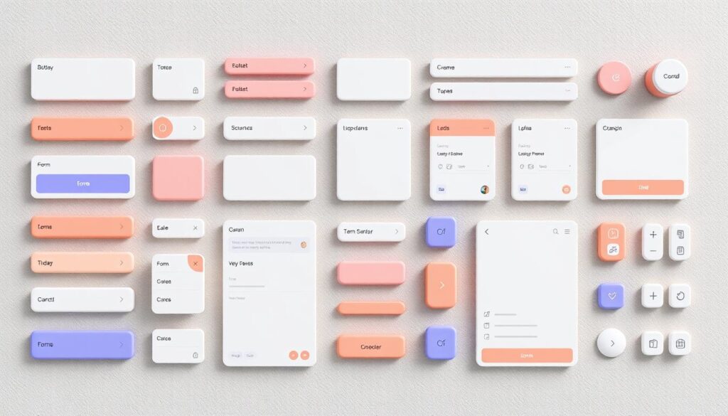
Front-end development has changed with CSS material design components. These components make websites look modern and easy to use. Google created Material Design for simplicity and smoothness, making it popular for web design.

For developers, using free CSS libraries is a smart move. It lets them add Material Design to their projects fast and well.

Free CSS material design components make development easier and more consistent. They are great for both new and old websites. These tools and styles can really improve your design.

Key Takeaways

  • CSS material design components simplify the front-end development process.
  • Material Design ensures a cohesive and intuitive user interface.
  • Front-end developers can access numerous free CSS libraries.
  • Free CSS libraries help in quickly adopting Material Design principles.
  • Effective use of these components can enhance the visual appeal and functionality of websites.

Introduction to CSS Material Design Components

Material Design is a favorite among front-end developers and designers. It blends classic design with new tech. This mix creates a visual language that’s both cohesive and easy to use.

What is Material Design?

Google created Material Design to make experiences consistent across devices. It uses material design principles like grid layouts and animations. These help make designs clean, modern, and easy to use.

“Material Design is a unified system that combines theory, resources, and tools for crafting digital experiences. It is backed by open-source code aimed at helping teams build high-quality digital products.” — Google Design

Why Use CSS Material Design Components?

Using CSS Material Design components has many benefits. They follow user interface design best practices, making development faster. They work well on all devices, ensuring a smooth experience.

These components also improve usability and accessibility. This helps both developers and users. Using them makes workflows more efficient, allowing teams to focus on content and functionality.

Top Free CSS Material Design Frameworks

We’ll look at the top free CSS frameworks for Material Design on web projects. These open-source CSS tools have many features and elements. They make web development easier and make your apps look better. We’ll focus on Materialize CSS, MDL (Material Design Lite), and Material Components for the Web.

Materialize CSS

Materialize CSS is a modern framework based on Material Design. It has many components like buttons and cards, following Google’s Material Design. It’s also responsive, so your web pages look good on any device.

It’s great for developers who want to build beautiful UIs fast.

MDL (Material Design Lite)

Material Design Lite (MDL) is a front-end framework by Google. It’s lightweight and has few dependencies. It includes components like grids and sliders, all for better performance and use.

MDL is perfect for quick development without complex CSS frameworks.

Material Components for the Web

Material Components for the Web offers customizable web components inspired by Material Design. These components are built on modern web standards. They’re flexible, allowing developers to customize their apps.

Its modular design lets you pick only the components you need. It works well with other front-end frameworks, making development smooth.

Benefits of Using CSS Material Design Libraries

Using CSS Material Design libraries in your projects has many benefits. They make web development more efficient. These libraries help create cohesive user interfaces that look good and work well.

One big plus is cross-browser compatibility. It’s hard to make sure web apps work the same on all browsers. CSS Material Design libraries fix this by offering tested components that work the same everywhere. This cuts down on debugging time and makes the user experience smooth.

Another key advantage is saving time during development. These libraries have lots of pre-made parts like buttons and forms. You can customize them for your project. This means you don’t have to start from scratch, making web development faster.

Creating cohesive user interfaces is also a big plus. Material Design focuses on consistency and design that puts the user first. This makes the final product look good and easy to use. Users feel more comfortable and confident when they see familiar design elements.

Benefit Description
Efficient web development Speeds up the development process by providing ready-to-use components.
Cohesive user interfaces Ensures design consistency and user satisfaction through well-designed UI components.
Cross-browser compatibility Guarantees uniform behavior across different browsers, reducing debugging time.

CSS libraries are key in web development, making design easier. For material design, UIkit and MUI are top picks. They provide front-end UI components and developer tools for beautiful and easy-to-use sites.

CSS libraries material design

UIkit

UIkit is a lightweight framework for fast, strong web interfaces. It fits well with material design, perfect for developers wanting a clean UI. It has:

  • Modularity for easy use
  • A wide range of front-end UI components
  • Flexibility to change designs

MUI (formerly known as Material-UI)

MUI is a top CSS library for material design. It makes modern web apps easy to build. It has many developer tools and front-end UI components for material design. Key features include:

  • Customizable themes and components
  • Great documentation and community support
  • Works well with React for quick development

Here’s a comparison of UIkit and MUI:

Feature UIkit MUI
Modularity High Medium
Customization Flexible Highly Customizable
Community Support Moderate Extensive

How to Integrate CSS Material Design Components in Your Project

Adding CSS Material Design components to your project might seem hard. But, following the right steps makes it easier. This guide will show you how to include CSS libraries and customize components for a scalable web design.

Including CSS Libraries

To start, add the needed CSS libraries to your project. Materialize CSS and Material Design Lite are great choices. They have detailed guides and easy-to-use features. Just add the CDN link to your HTML file:

<link rel=”stylesheet” href=”https://cdnjs.cloudflare.com/ajax/libs/materialize/1.0.0/css/materialize.min.css”>

Also, many CSS frameworks need JavaScript. Make sure to add these scripts at the end of your HTML for better performance.

Customizing Components

After adding libraries, customize components for your project. Custom CSS lets you change colors, fonts, and layouts. This makes your design unique and scalable. Here’s how to customize a Materialize CSS button:

.custom-button {
background-color: #2196F3;
color: white;
border-radius: 8px;
}

For more advanced customizations, explore the framework’s documentation. Learning custom CSS helps you create stunning, responsive designs. This meets your project’s needs perfectly.

In summary, integrating CSS Material Design components is about adding libraries and using custom CSS. These steps make the process easier and ensure your web design is efficient and scalable.

Step Description Example Code
1. Include Libraries Insert the CSS and JS libraries into your HTML file. <link rel=”stylesheet” href=”https://cdnjs.cloudflare.com/ajax/libs/materialize/1.0.0/css/materialize.min.css”>
2. Customize Components Use custom CSS to adjust component styles. .custom-button { background-color: #2196F3; color: white; border-radius: 8px;}

CSS Material Design Templates for Quick Start

Starting a project with CSS material design templates can speed up your work. These templates meet many project needs, helping you work fast without losing quality. We’ll look at pre-built templates and why responsive design is key.

Pre-built Templates

Pre-built templates are a great way to start any web project. They are made to be changed easily, fitting your project’s needs. You can find templates for:

  • Landing Pages
  • eCommerce Sites
  • Portfolio Showcases
  • Dashboards and Admin Panels

These templates make sure your site looks good and works well from the start. They save time and give your website a professional look.

Responsive Design Considerations

It’s important for your website to work well on all devices. Responsive design makes this easy. These templates adjust to different screens and sizes, giving a smooth user experience. Focus on:

  • Fluid Grid Layouts
  • Flexible Images
  • Responsive Navigation Menus
  • Adaptive Typography

Adding these features helps you work fast and makes your site look good on all devices.

Template Type Key Features Responsive Design
Landing Page Hero Section, Call-to-Action Buttons Optimized for mobile and desktop
eCommerce Product Grids, Checkout Process Mobile-friendly shopping experience
Portfolio Responsive Galleries, Project Descriptions Adjusts to various screen sizes
Admin Panel Dashboard Layouts, Data Visualizations Consistent across all devices

Using these CSS material design templates helps developers start projects quickly. They ensure your site works well on all devices from the start.

Creating Custom CSS Material Design Components

Developers can add a special touch to their projects by making custom CSS Material Design components. This guide will cover the basics of creating these components. Then, it will show advanced techniques for making unique and creative UI components.

Understanding the Basics

First, learn the basics of CSS customization. Get to know Material Design principles. This ensures your custom components look consistent and cohesive. Start by picking common components to customize, like buttons, cards, and forms.

  • Define component structure using HTML
  • Implement basic styles with CSS
  • Incorporate Material Design guidelines

Advanced Customization Techniques

After mastering the basics, dive into more complex CSS customization techniques. These will make your components stand out and work better.

  1. Use CSS preprocessors like SASS or LESS
  2. Add JavaScript for better interactivity
  3. Try CSS animations for cool effects

Here’s a look at tools and methods for making custom components well:

Tool/Methodology Benefits Examples
CSS Preprocessors (SASS, LESS) Enhanced modularity and reusability Variables, Mixins, Functions
JavaScript Enhancements Improved interactivity and user experience Event Listeners, DOM Manipulation
CSS Animations Dynamic and engaging UI elements Keyframes, Transitions

By using advanced techniques and Material Design principles, you can make custom components that look great and work well. This way, your creative UI components will improve the user experience while keeping the Material Design look.

Best Practices for Using Material Design CSS Resources

To get the most out of Material Design CSS resources, focus on design consistency and performance. These best practices will improve your user experience and make your web projects look professional.

Design consistency

Consistency in Design

Keeping your design consistent is key for a user-friendly interface. Following a style guide ensures all elements look the same. This makes your app easy to use and understand. Here are some tips for consistent design:

  • Stick to a unified color palette and typography.
  • Use grid systems to align elements uniformly.
  • Create reusable CSS classes for frequently used styles.
  • Ensure that interactive elements (like buttons) have consistent states (hover, active, etc.).

Performance Optimization

Boosting web performance is vital for a smooth user experience. Optimizing your Material Design components can make your site faster and improve SEO. Here are some top performance tips:

  1. Minimize CSS and JavaScript files using tools like UglifyJS.
  2. Leverage browser caching to store frequently accessed files locally.
  3. Implement lazy loading for images and other media.
  4. Ensure that CSS selectors are efficient to avoid unnecessary reflows and repaints.
Best Practices Benefits
Design Consistency Improved UX and cohesive visual language
Performance Optimization Faster load times and enhanced web performance
Reusable Components Streamlined development process

Common Challenges and How to Overcome Them

Developers often face challenges when using CSS material design components. They deal with browser and device compatibility issues. They also make sure the design is accessible to everyone. Here, we share troubleshooting tips to help overcome these common problems.

Compatibility Issues

Web compatibility is a big challenge with CSS material design components. Different browsers see CSS in different ways, leading to inconsistent results. To solve these problems, try these troubleshooting tips:

  1. Use vendor prefixes: Adding vendor prefixes to your CSS rules can improve compatibility across browsers.
  2. Test on multiple devices: Testing on various browsers and devices helps find and fix issues early.
  3. Utilize CSS resets: Using a CSS reset can standardize styles, reducing differences between browsers.

Regular testing and following web best practices can greatly improve web compatibility for your CSS material design projects.

Ensuring Accessibility

Making your design accessible is key to making web applications usable for everyone. This includes people with disabilities. Here are some important steps and troubleshooting tips to ensure your design is accessible:

  • Semantic HTML: Use semantic HTML tags to improve screen reader navigation.
  • Contrast and color choices: Make sure colors have enough contrast for users with visual impairments.
  • Keyboard navigation: Make interactive elements easy to navigate with a keyboard for better accessibility.

Using these accessible design strategies makes your web experience more inclusive and user-friendly for everyone.

Case Studies: Successful Implementations

We explore the world of CSS material design through interesting case studies. These stories show how material design is used in real-world projects. They highlight how it can make digital products look better and work better too. Companies of all sizes have shared their experiences, showing how they mixed new ideas with practical solutions.

Google’s redesign of G Suite is a great example. They used material design to make their product easier to use. This shows how important it is to make things consistent and easy to use.

successful implementations

Airbnb also used material design to improve their app. Their work shows how good design can make users happier and more engaged. They focused on making the app easy to use and nice to look at.

Meta, formerly Facebook, used material design in their Workplace platform. They wanted it to be clear and efficient. Their story shows how design systems can make tools for work better and more fun to use.

The table below summarizes these success stories. It shows the main points and what was achieved by using CSS material design.

Company Application Key Achievements
Google G Suite Improved Cohesion & Accessibility
Airbnb Mobile App Enhanced User Engagement & Satisfaction
Meta (Facebook) Workplace Streamlined Communication Tools

These case studies offer insights into the benefits of material design. They show how it can make a big difference. Designers can learn from these examples and improve their own work, helping future projects succeed.

Looking ahead, web design is set for a big change. New CSS trends are coming that will change how we design and build websites. These trends will bring new design ideas and UI designs to CSS material design.

Upcoming Frameworks

New frameworks are on the horizon, promising to make web development easier and more flexible. These frameworks aim to make coding faster and more efficient. They will also support the latest web design needs.

These frameworks will include smarter components, quicker loading times, and better UI design support. This means websites will be more user-friendly and visually stunning.

Innovative UI Patterns

New UI patterns are also on the way, bringing fresh ideas to web design. These patterns aim to make websites more engaging and interactive. They include micro-interactions, animations, and designs that adapt to the user’s context.

By using these new UI designs, developers can create websites that are not only easier to use but also more beautiful. This will lead to a better user experience overall.

Community and Support for CSS Material Design Enthusiasts

For those diving into CSS material design, connecting with the developer community is key. There’s a lot of knowledge online. Finding the right support forums or GitHub repositories can greatly help your project.

Online Forums

Online support forums are a goldmine for developers using CSS material design. Sites like Stack Overflow and Reddit are great places to ask questions and share tips. They help you solve problems quickly and learn from others.

GitHub Repositories

GitHub material design repositories are crucial for finding pre-made components and open-source projects. Material-UI and Materialize CSS are great examples. They offer detailed guides, code examples, and community support. By getting involved, you improve your skills and help the community grow.

Conclusion

As we conclude our talk on CSS material design components, it’s clear that using these web development resources is a big plus for front-end developers. We’ve looked into what material design is, talked about frameworks like Materialize CSS, and seen the many benefits they offer. Using material design in web projects makes things look consistent and improves how users feel by following Google’s design rules.

Our exploration of CSS material design libraries, tips for customizing, and best practices shows how important it is to keep learning and adapting. Getting involved in the design community on GitHub and online forums can give you great help and ideas. By staying up-to-date with new trends, developers can solve problems and make their projects run better.

The future of material design in web development looks exciting, with new UI patterns and frameworks on the horizon. Adopting these new things will make designing easier and create user interfaces that really grab people’s attention. With this knowledge, front-end developers are ready to use free CSS material design components to take their projects to the next level.

FAQ

What are CSS Material Design components?

CSS Material Design components are tools for making websites look good and work well. They follow Google’s Material Design rules. This helps developers make user interfaces that are both pretty and easy to use.

Why should I use CSS Material Design components in my web projects?

Using these components makes your website look better and work smoother. It makes your design modern and easy to use. This improves how users feel when they visit your site.

Are there free libraries available for CSS Material Design components?

Yes, there are many free libraries for Material Design. Some popular ones are Materialize CSS, MDL (Material Design Lite), and Material Components for the Web.

How can I integrate CSS Material Design components into my project?

To add these components, just include the CSS libraries in your project. You can also change them to fit your design needs. There’s usually a lot of help online to guide you.

What are some of the best CSS Material Design libraries?

Top libraries include Materialize CSS, UIkit, and MUI (formerly Material-UI). They offer lots of tools and components to make Material Design easy to use.

What benefits do CSS Material Design libraries offer?

These libraries make web development faster and more efficient. They help create beautiful and consistent user interfaces. Your websites will work well on all browsers.

Where can I find CSS Material Design templates for a quick start?

You can find free CSS Material Design templates online. They help you start your project fast. They also make sure your design is responsive and looks great.

How can I customize CSS Material Design components?

To customize, you need to know some CSS and Material Design basics. You can change styles, override defaults, and even create new components with CSS.

What are best practices for using Material Design CSS resources?

Keep your design consistent and make sure it loads fast. This makes your website look professional and work well. It’s all about making a great user experience.

What common challenges might I face, and how can I overcome them?

You might face problems with different browsers and making sure everyone can use your site. To solve these, test well, use polyfills, and follow accessibility rules. This way, your site will be good for everyone.

How does the community support CSS Material Design enthusiasts?

The community helps a lot through online forums and GitHub. You can share ideas, get feedback, and learn about new things. It’s a great place to grow and learn together.

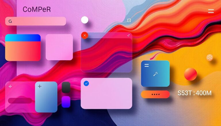
The need for sleek, modern web designs is growing fast. CSS Material is here to help. It lets designers and developers make stunning, easy-to-use websites and apps. It’s based on Material Design, offering tools and components for beautiful, functional web experiences.

CSS Material combines Material Design’s key elements like typography, colors, and grid layouts. This makes it easy to bring Material Design to your web projects. Your users will get a smooth, consistent experience everywhere.

css material

Key Takeaways

  • CSS Material is a robust framework for creating modern, visually-appealing web interfaces
  • It is based on the principles of Material Design, a widely-adopted design language
  • CSS Material provides a comprehensive set of tools and components to streamline the development process
  • Designers and developers can leverage CSS Material to craft consistent, user-friendly web experiences
  • The framework offers responsive grid layouts, typography scaling, and color system management

Understanding CSS Material Design Fundamentals

Modern web design focuses on making websites both beautiful and easy to use. CSS Material Design, created by Google, provides a detailed guide for this. It helps designers use visual hierarchy and design components to make digital experiences better.

Core Principles of Material Design

Material Design is built on key principles like simplicity, responsiveness, and consistency. These include:

  • Tactile Surface: Using material qualities for a real and natural feel.
  • Bold Imagery: Using strong visuals and typography to grab attention and share info.
  • Fluid Motion: Adding smooth animations and transitions for a better look and feel.
  • Adaptive Layouts: Creating layouts that work well on all screens and devices.

Visual Language and Hierarchy

The visual language of Material Design is clean and structured. It uses material design principles for a unified and easy-to-use interface. This includes strategic element placement, clear typography, and colors that fit the overall look.

Material Design Components

Material Design has a wide range of pre-made design components. These include buttons, menus, cards, and dialogs. Using these elements helps designers make websites faster and keep them consistent.

By grasping Material Design’s basics, designers can make amazing digital experiences. These experiences engage and captivate their audience.

Getting Started with CSS Material Frameworks

CSS Material frameworks can change how you design websites. They are key for making modern, beautiful sites. Whether you’re new or experienced, learning these tools is essential.

Google’s Material-UI is a top CSS framework for Material Design. It has many pre-built components for fast, accessible UIs. Just follow the setup guide to start using it in your projects.

Vuetify is another great CSS framework. It mixes Vue.js with Material Design’s look. It has lots of customizable parts, perfect for Vue.js users.

  1. Choose the right CSS framework for your project. Think about compatibility, support, and needed features.
  2. Check the setup guide for your chosen framework. It helps with a smooth Material Design implementation.
  3. Learn about Material Design’s core principles. This will help with your design and component choices.
  4. Look at the framework’s components and customization options. This lets you make a unique user experience.
CSS Framework Key Features Popularity
Material-UI Extensive component library, robust theming, accessibility support High
Vuetify Integrates seamlessly with Vue.js, comprehensive documentation, active community Medium to High
Angular Material Optimized for Angular ecosystem, comprehensive UI components, accessibility focused High

“Embracing CSS Material frameworks is a game-changer for web developers, allowing them to create visually stunning and highly functional user interfaces with ease.”

Using CSS Material frameworks speeds up your work. It ensures your designs are consistent and user-friendly. With the right knowledge, you’ll excel in modern web design.

Key Features of Material Design Systems

Material Design is a visual language by Google. It has features for making modern, responsive, and attractive web experiences. It focuses on three main parts for great user experiences.

Responsive Grid Layouts

Material Design stresses responsive design. It makes sure content and interfaces work well on many devices. Its grid layout is flexible and scalable, helping designers create user-friendly interfaces for all devices.

Typography and Scaling

Typography is key in Material Design. It aims for legible and beautiful text. The system has guidelines for fonts, sizes, and scaling. This ensures text is easy to read and looks good across designs.

Color Systems and Palettes

Material Design’s color palettes are a big part of its look. These color systems give designers a range of colors. They help create striking and unified Material Design features that grab users’ attention and build a strong brand.

Material Design’s core principles of responsive design, typography, and color help designers and developers. They make experiences that look good and work well.

Material Design is a top choice for web development. It helps create beautiful and easy-to-use interfaces. Many Material Design libraries and CSS frameworks have come out to make it easier to use. Let’s look at some popular Material Design CSS libraries and what they offer.

Material-UI

Material-UI is a free CSS framework for React. It has lots of customizable components. You can find everything from buttons to data tables, making it great for modern web apps.

Vuetify

Vuetify is a Material Design component framework for Vue.js. It has a lot of pre-built components and a responsive grid system. It’s known for its performance and ease of use for Vue.js developers.

Ionic Framework

Ionic Framework is a big open-source UI toolkit with a Material Design theme. It’s mainly for mobile and desktop apps, but its Material Design parts work for web projects too.

Library Framework Pros Cons
Material-UI React
  • Comprehensive component library
  • Highly customizable
  • Strong community and documentation
  • Steep learning curve for beginners
  • Dependency on React
Vuetify Vue.js
  • Seamless integration with Vue.js
  • Responsive and accessible components
  • Extensive documentation and community support
  • Limited to Vue.js projects
  • Potential performance issues with larger applications
Ionic Framework Cross-platform
  • Supports multiple frameworks (React, Angular, Vue.js)
  • Optimized for mobile development
  • Material Design-inspired UI components
  • May be overkill for purely web-based projects
  • Steeper learning curve for web-only developers

There are many Material Design libraries and CSS frameworks out there. Choose the one that matches your project, development stack, and preferences.

Implementation Strategies for Material Design

Using Material Design in your web projects can make a big difference. It offers a modern look and a great user experience. To get the most out of it, you need to know the best ways to use it. Let’s explore the key steps to make Material Design work well in your web projects.

Setup and Installation Guide

The first thing to do is set up the framework and get the needed tools. You’ll likely use a CSS library like Google’s Material Design Lite or Material-UI. The setup might change based on your project and the library you pick. But, most libraries have easy-to-follow guides to help you.

Basic Configuration Steps

Once you have the framework, you need to set up the basics of Material Design. This includes picking your colors, fonts, and other visual details. Many libraries let you customize these to fit your brand. Knowing how to use these options is important for a smooth integration.

Common Implementation Patterns

  • Responsive Grid Layouts: Material Design uses a grid system for different screen sizes. This helps make your interface look good on any device.
  • Material Components: Use pre-made components like buttons and cards to make your app look consistent and save time.
  • Animation and Transitions: Adding smooth animations makes your app more engaging and follows Material Design’s rules on motion.

By using these strategies, you can make your web projects look great and work well. This will make your users happy and keep them coming back.

“Material Design is a cohesive and comprehensive design language that provides a clear framework for building high-quality digital experiences.”

CSS Material Components and Elements

The CSS Material Design framework is great for modern web projects. It has a wide range of UI components and elements. These are designed for easy use, consistent look, and work well on all devices.

Let’s look at some key Material Design components and how to use them with CSS:

  • Buttons – Material Design has many button styles, like raised and flat. Each has its own CSS classes for customization.
  • Cards – Cards are key in Material Design. They hold content, images, and actions. The CSS for cards includes elevation and hover effects.
  • Navigation Menus – Material Design menus, like top bars and drawers, keep your site organized. They have CSS for alignment and interactive states.
  • Form Controls – Material Design form controls, like text fields and switches, have unique styles. They make the user experience better.

Using Material Design components and CSS styles helps create great interfaces. It’s important for making modern, responsive web apps.

Material Design components

“Material Design components provide a consistent and polished user experience, allowing developers to focus on building functional and engaging web applications.”

Exploring CSS Material Design opens up many resources and best practices. These help you use UI elements well in your projects. Embracing Material Design improves your web app’s look and feel.

Responsive Design with Material CSS

In today’s digital world, making websites that work well on all devices is key. Material CSS helps designers make websites that look great on any screen size. It’s all about creating websites that are easy to use on phones, tablets, and computers.

Breakpoint Management

Material CSS makes it easy to change how a website looks on different screens. Designers can set up special points where the layout changes. This way, websites look good on any device, from big computers to small phones.

Fluid Typography

Material CSS is known for its fluid typography. This means text looks right on any screen size. It uses smart font sizes and units to make sure text is easy to read on all devices.

Mobile-First Approach

  • Material CSS promotes a mobile-first design. Designers start by making websites work well on small screens.
  • This method makes sure the main content is easy to use on any device.
  • Then, designers add more features for bigger screens, using Material CSS’s flexibility.

Material CSS helps designers make websites that are easy to use on all devices. It uses responsive web design, mobile-first development, and fluid typography. This way, websites are fun and work well for everyone.

Material Design Animation and Transitions

Material Design makes your web designs come alive with CSS animations and smooth transitions. It sees motion as key, guiding the user and making the experience smooth and easy.

At the heart of Material Design are CSS animations and transition effects. These tools let designers add movement and feedback to user actions. This makes the interface look better and work better too.

Crafting Delightful Animations

Material Design animations follow rules to make the user experience great. Some important things to remember include:

  • Consistent easing and timing: Use standard Material Design motion for natural movements.
  • Hierarchy and focus: Guide the user’s attention to key elements.
  • Feedback and responsiveness: Show visual cues for user actions and system changes.

Implementing Smooth Transitions

Material Design is all about smooth transitions between states and components. Transition effects help create a sense of flow and understanding between interface parts.

Transition Type Description Example Use Case
Fade Gradual opacity change to show/hide elements Revealing a modal or popping up a tooltip
Scale Smooth scaling of elements to indicate importance Expanding a card or button on hover
Slide Horizontal or vertical sliding motion to navigate Transitioning between pages or sliding out a drawer

Designers who get good at CSS animations and transition effects can make interfaces that grab users’ attention. This makes the interactive experience better.

Customizing Material Design Themes

Material Design lets you customize it for your project needs. You can change the colors and create new components. This makes it easy to make a unique user experience that matches your brand.

In this section, we’ll dive into Material Design customization. We’ll explore theme creation and custom components.

Variable Customization

Material Design’s customization starts with its variable system. These variables are in SCSS or CSS and are the base of the framework’s look. By changing these variables, you can adjust colors, typography, and more to fit your brand.

This control lets designers and developers make a user interface that looks great and meets their audience’s needs.

Creating Custom Components

Material Design has many pre-built components. But sometimes, you need something special for your project. By using the framework’s design rules, you can add custom components that look like they belong.

This flexibility means you can make the user experience exactly how you want it. It ensures your solution is truly unique.

“The true beauty of Material Design lies in its ability to be molded and shaped to fit the needs of any project. With its robust customization options, you can create a unique and visually stunning user experience that truly reflects your brand’s identity.”

Learning to customize Material Design lets you use its full power. You can create theme creation and custom components that take your digital products to the next level.

Material Design customization

Performance Optimization Techniques

As web designers and developers, making sure your website performs well is key. Using Material Design frameworks can really help improve how fast your site loads. We’ll look at ways to make your Material Design projects run smoothly and quickly.

Minimize CSS File Size

One big way to speed up your site is to make your CSS files smaller. This can be done by removing extra stuff like whitespace and comments. This makes your stylesheet more compact and efficient.

Optimize CSS Selectors

Also, focus on making your CSS selectors better. Try to avoid complex or nested selectors. They can slow down how fast your site loads. Use simpler, more direct selectors to make styles apply faster.

Reduce Render-Blocking Resources

Material Design sites often use lots of resources like fonts and JavaScript. These can slow down how fast your site loads. Find ways to reduce these resources to make your site load faster.

  • Defer the loading of non-critical JavaScript files
  • Use asynchronous loading techniques for scripts
  • Optimize the delivery of web fonts by leveraging browser caching and font subsetting

By using these optimization techniques, you can make your Material Design sites fast and efficient. This meets the need for quick, responsive, and good-looking digital experiences.

“Optimizing for performance is not only about delivering a better user experience, but it’s also essential for maintaining a competitive edge in today’s fast-paced digital landscape.”

Material Design Best Practices

Web applications are always changing. Keeping them web accessible and design consistent is key for a great user experience. Material Design, a modern web design framework, has its own set of best practices. We’ll look at the main guidelines for making your Material Design web apps accessible and consistent.

Accessibility Guidelines

Material Design focuses on making web apps accessible to everyone. This means your app should be usable by people with different abilities. Here are some tips to make your app accessible:

  • Make navigation clear and easy to use, with options for keyboard and screen readers.
  • Use enough color contrast between text and background for users with vision problems.
  • Use aria labels and roles for assistive tech.
  • Make sure screen readers can read out images and other non-text content.

Design Consistency

Keeping your design consistent is vital for a smooth user experience. With Material Design, aim for consistent use of these elements:

  1. Use a clear typographic hierarchy and font styles.
  2. Stick to a color palette and theme.
  3. Keep your layout and grid structure consistent.
  4. Use the same icons and visual elements.
  5. Follow the same interaction patterns and animations.

Following these best practices will make your Material Design web app accessible, easy to use, and visually appealing. This will improve the user experience for your users.

“Consistency is the key to creating a seamless and intuitive user experience, and it’s especially crucial when working with a design framework like Material Design.”

Troubleshooting Common Issues

Material Design CSS can sometimes be tricky to work with. But don’t worry, we’ve got you covered. We’ll look at fixes for common problems, like browser issues and styling conflicts.

Developers often struggle to make their Material Design sites work on all browsers. Google Chrome does a great job with Material Design, but other browsers might look a bit different. Knowing which browsers support Material Design can help you fix any problems.

Styling conflicts can also pop up when using Material Design with existing CSS. These conflicts can mess up your layout or look. To solve this, it’s key to understand how CSS works and how to change Material Design styles when needed. Using a modular coding style can also help avoid these issues.

FAQ

What is CSS Material?

CSS Material is a modern web design framework. It follows Google’s Material Design principles. It offers tools and guidelines for creating sleek, responsive, and visually appealing web interfaces.

What are the core principles of Material Design?

Material Design focuses on bold, intuitive visuals. It uses grid-based layouts and strategic typography and color. It also uses animations and transitions to enhance the user experience.

How do I get started with CSS Material frameworks?

To start with CSS Material frameworks, choose a library like Material-UI or Materialize CSS. Follow their setup guides. This involves installing the framework and linking CSS and JavaScript files in your project.

What are some of the key features of Material Design systems?

Material Design systems have responsive grid layouts and scalable typography. They offer comprehensive color palettes and customizable UI components like buttons and cards.

Popular CSS Material Design libraries include Material-UI and Materialize CSS. They offer customization, feature sets, and integration with various front-end frameworks.

How do I implement Material Design principles in my web project?

To implement Material Design, follow a structured approach. Set up the framework, configure basic settings, and use common patterns for typography, color, and animations.

What strategies can I use to optimize the performance of a Material Design-based website?

To optimize a Material Design website, use CSS minification and efficient selector targeting. Reduce render-blocking resources. Ensure your implementation follows accessibility and design consistency best practices.

How can I customize Material Design themes to fit my brand’s visual identity?

Customize Material Design themes by using variable-based theming. Modify color palettes, typography, and visual elements to match your brand. Create custom UI components to extend the design system.